Case Study:
An App That Helps Parents Find Stories to Read to Their Kids

The Problem:
Tiny Tales, a startup with a library of unique children’s books, needs an app to make it easier for parents to find a story to read to their kids.
The Solution:
A week-long modified GV Design Sprint resulting in a validated prototype which addresses the key user pain points.
My Role:
- UX Design
- Information Architecture
- Wireframing
-
UI Design
-
Visual Design
- Prototyping
- Usability Testing
The Brief
Tiny Tales is a start-up built around a library of unique children’s short stories, picture books and educational books for kids aged 4-9. As they have grown their library of stories, parents say it has become difficult and time consuming to sort through all of the stories to find the right one to read to their children.
I was asked to conduct a 5 day modified GV Design Sprint to design and test a possible solution.
There were some existing design constraints from the client to consider:
- The client is asking for an iPad or Tablet app - as they are the go-to devices for their users.
- Stories are already contributed to the app by writers and illustrators, so the focus of the design sprint should center on how a parent can use the app to find the right story and read it to their kid - no hard copies of books are involved.
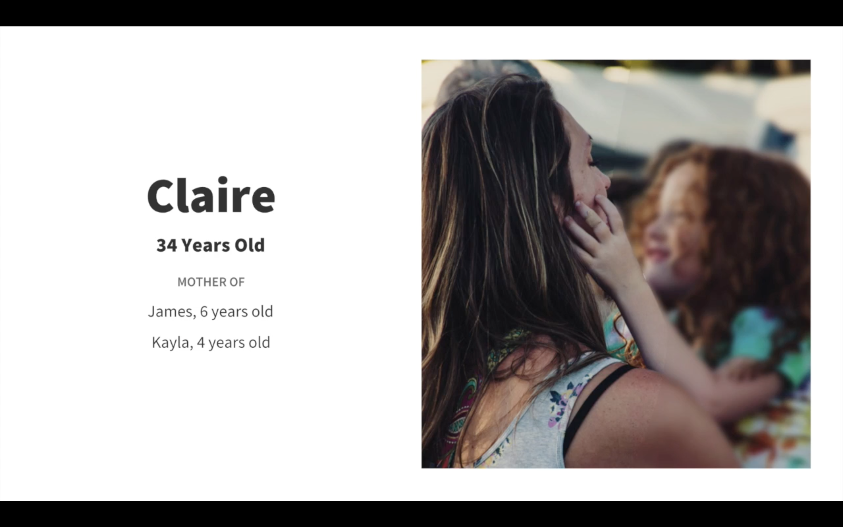
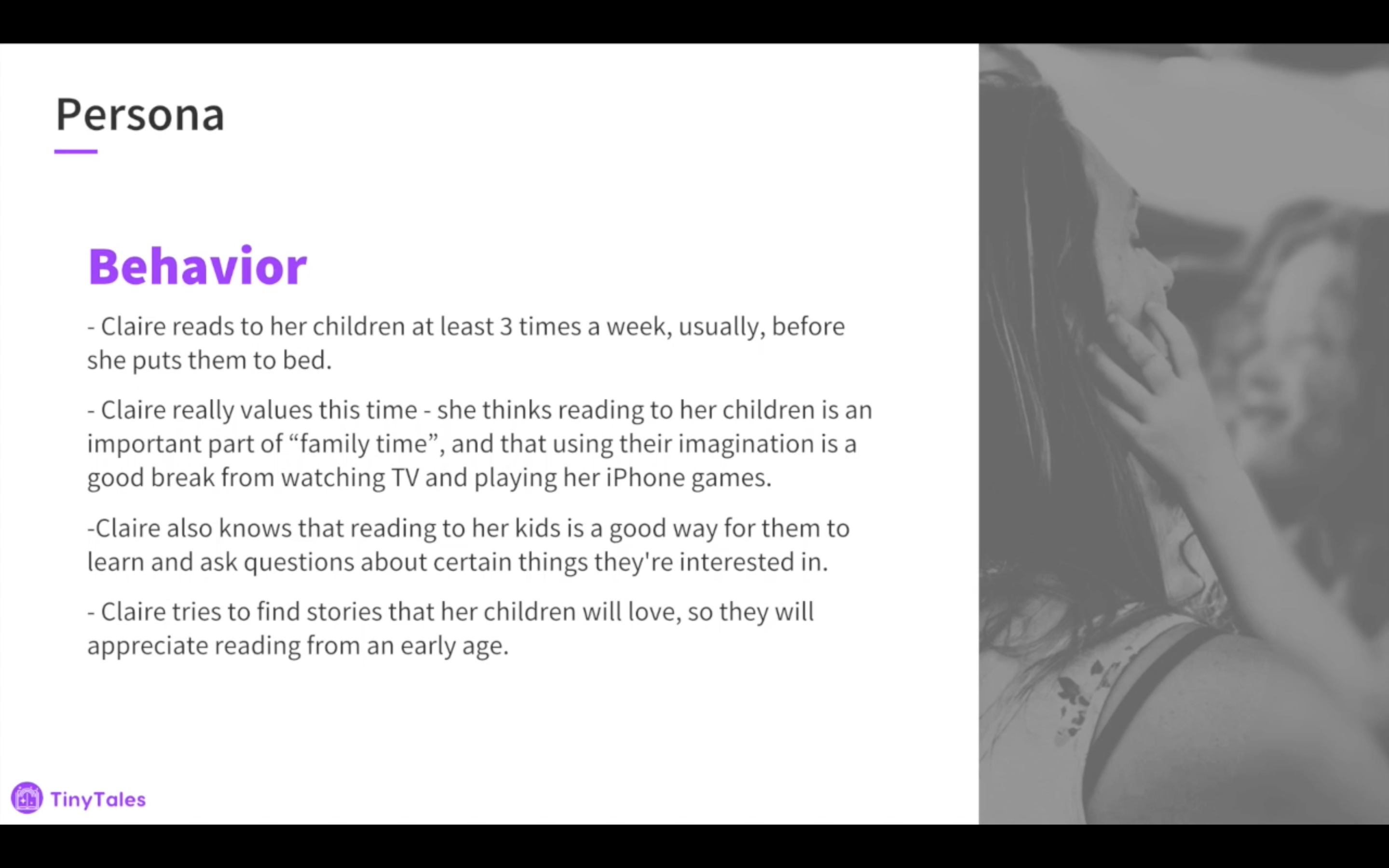
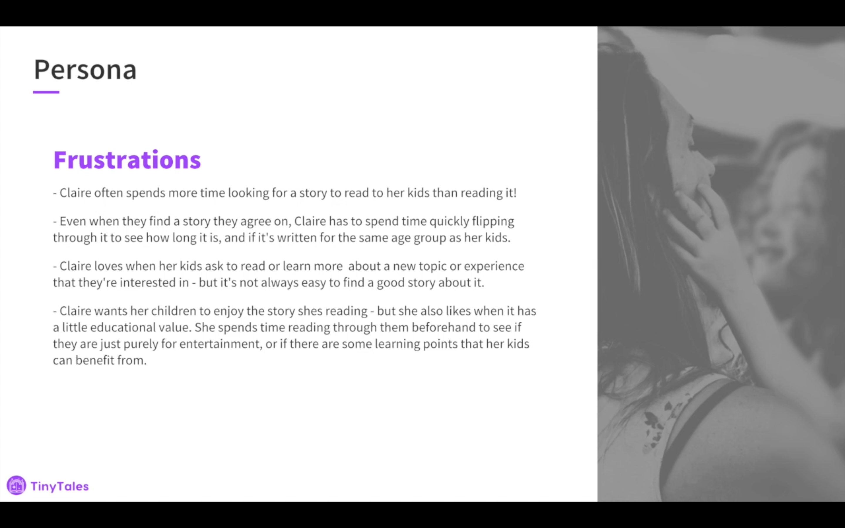
Research
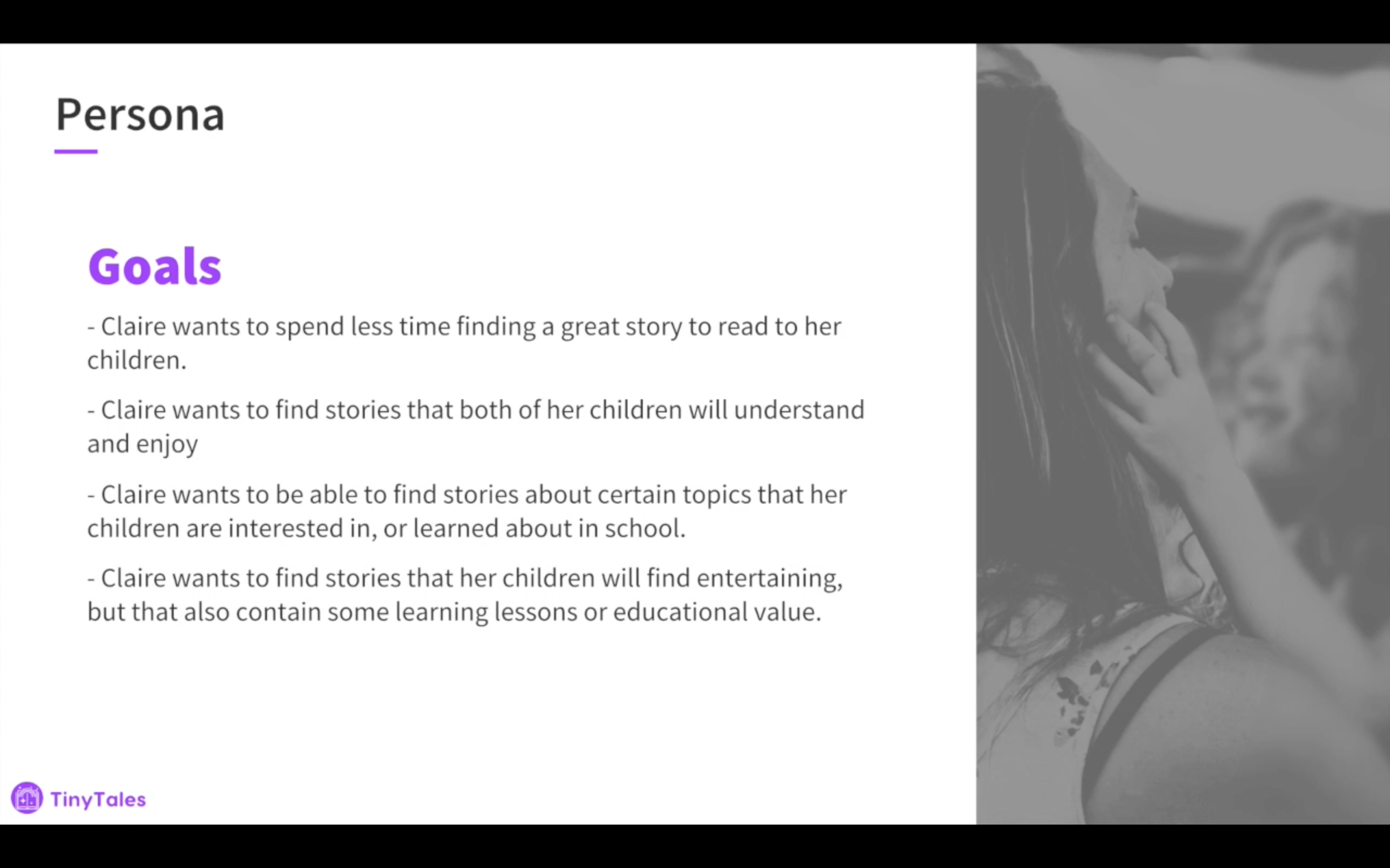
The research provided by the client included user interviews and a user persona. These showed that finding the right story(s) to read is often tricky and overly time-consuming because:
- It’s difficult to find relevant stories their kids are interested in, and those interests change often
- It’s difficult to find the right ‘length’ of story, especially if reading around bed time
- It’s difficult to find stories that are age appropriate for one or sometimes several kids of different ages or comprehension levels
- Sometimes parents will need to have 3 or 4 books per reading session
Further key insights gleaned from the research:
- Kid’s may pick a topic, and parents may search using this topic and pre-read a story for a few pages to see if it’s a good fit and to check the length
- Online reviews of books are helpful to assess a story’s age level and enjoyment level
- Some parents get their book recommendations from other parents
- If their kid likes a particular story, a parent may try to find other titles by that author to check out
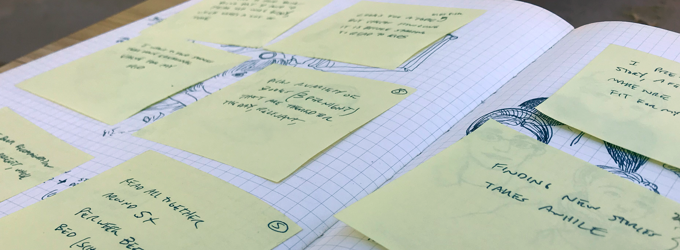
Synthesizing the Data
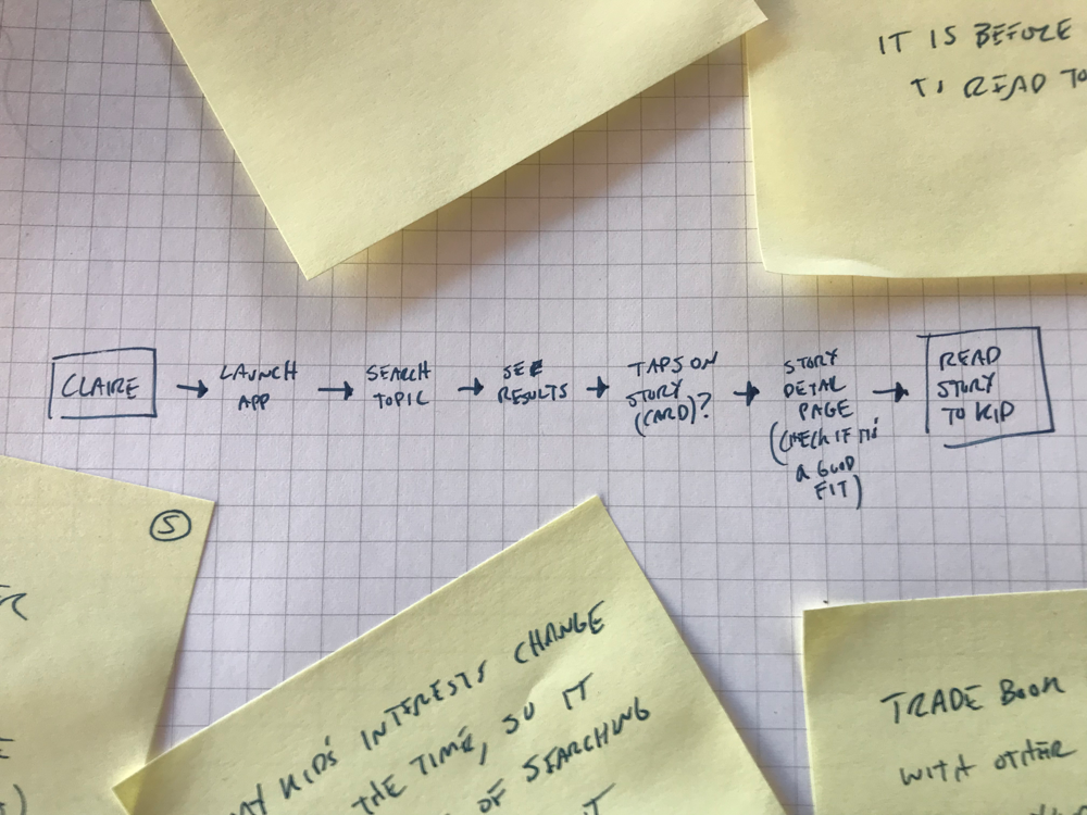
After downloading all of the research into an affinity map to organize user’s thoughts, I created an end to end user experience map of the product’s main red route and desired outcome.
Sketching
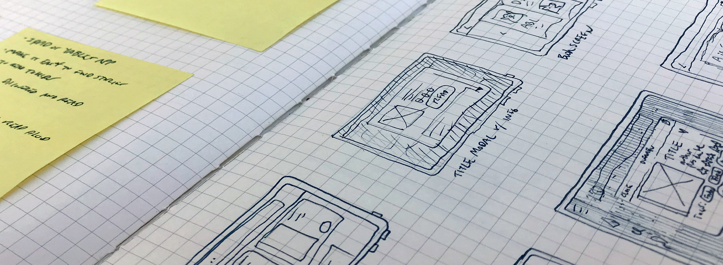
Once our main design problem and user experience map were established, I set to quickly sketching out some possible design solutions related to the primary screen of the experience - the product detail page.
Using the Crazy 8’s method I created quick ideations of what this important screen could look like.
I leveraged the findings from a Lightning Demo I conducted to to explore other relevant products in the space. This process gave me a good overview of how competitors with similar experience maps achieve the desired outcome, while also giving me some ideas to help make the experience of this app even better than those competitors.

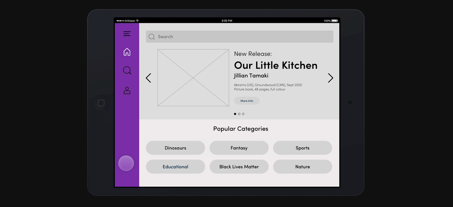
I chose the best sketch from my Crazy 8’s exercise to create the above solution sketch for our primary screen, along with the screens immediately before and after in our user experience map.
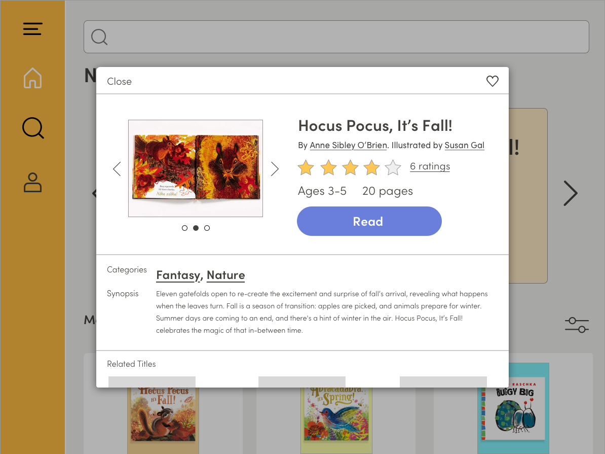
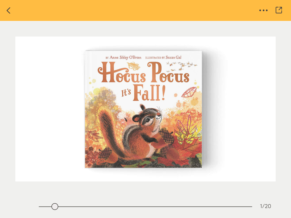
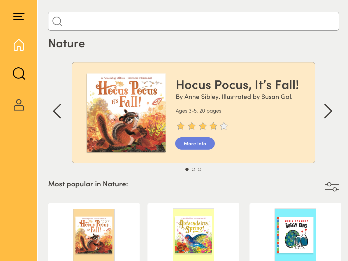
The solution uses a product detail modal that displays all of the information our users told us was important to them. The design is easily scannable and has a clear call-to-action.
![]()
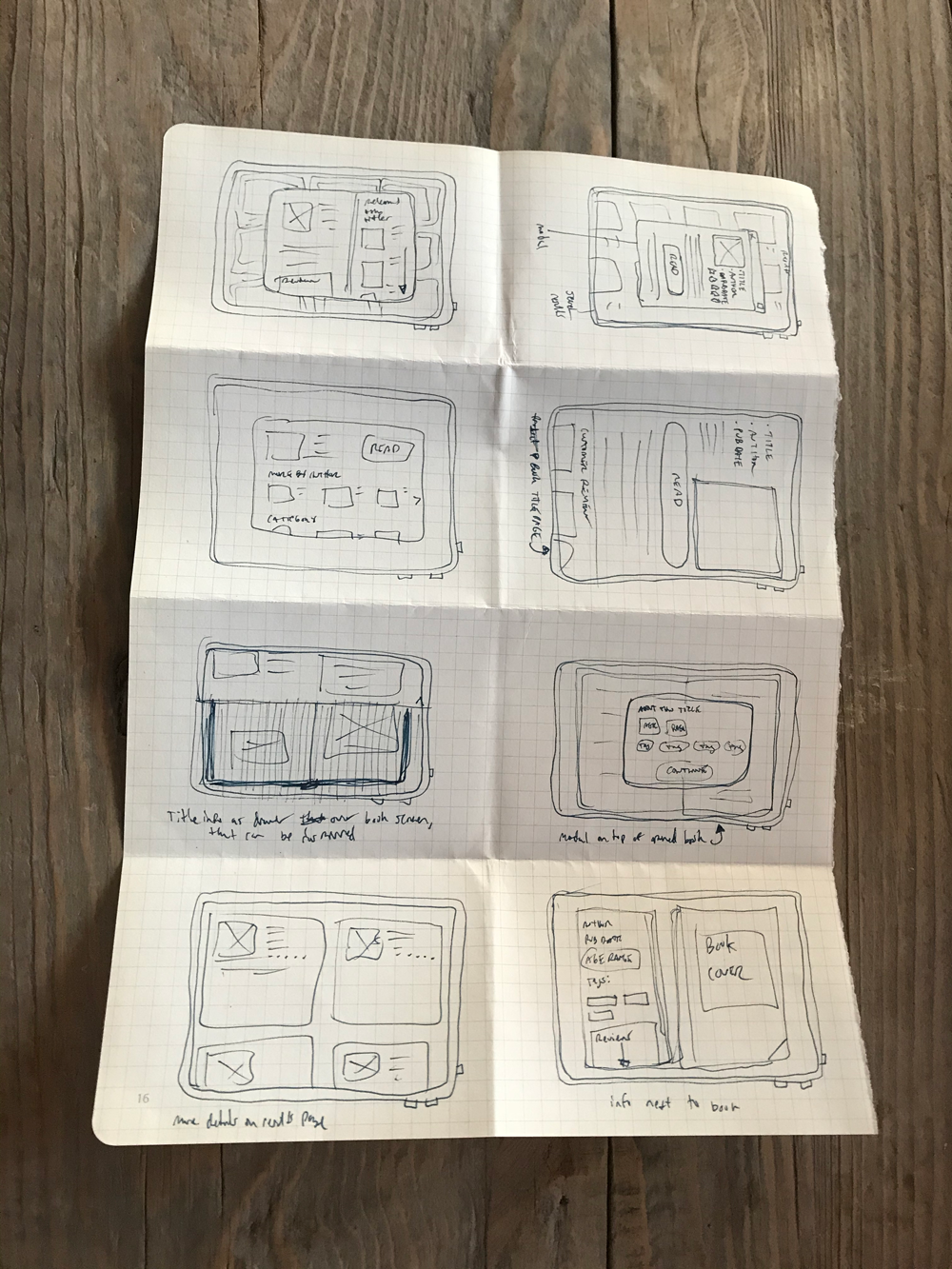
I then sketched a tighter storyboard of the full experience.
Here is where I had a chance to iron out any glaring errors in the information architecture, and where I started to get a clearer idea of the visual hierarchy our users would find the most helpful to finding a book to read to their child.
The solution uses a product detail modal that displays all of the information our users told us was important to them. The design is easily scannable and has a clear call-to-action.

I then sketched a tighter storyboard of the full experience.
Here is where I had a chance to iron out any glaring errors in the information architecture, and where I started to get a clearer idea of the visual hierarchy our users would find the most helpful to finding a book to read to their child.
Prototype
Using the storyboard as a framework, I used Sketch to create all of the screens at low to medium fidelity. I used these screens to create a testable prototype, which was assembled in InVision.
While the general flow remained unchanged, as I worked through the prototype screens I adjusted the hierarchy of some elements - especially on the critical screen.
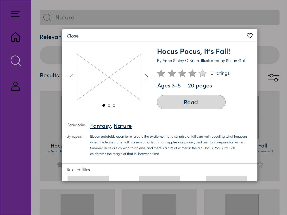
Thinking back to the user research we synthesized at the beginning of the sprint, I saw an opportunity to enable users to quickly peruse the contents even before tapping the ‘Read’ CTA by adding a carousel element to the modal. Also, users could quickly get a sense of the number of words on each page while comparing it to the age range and page number information.
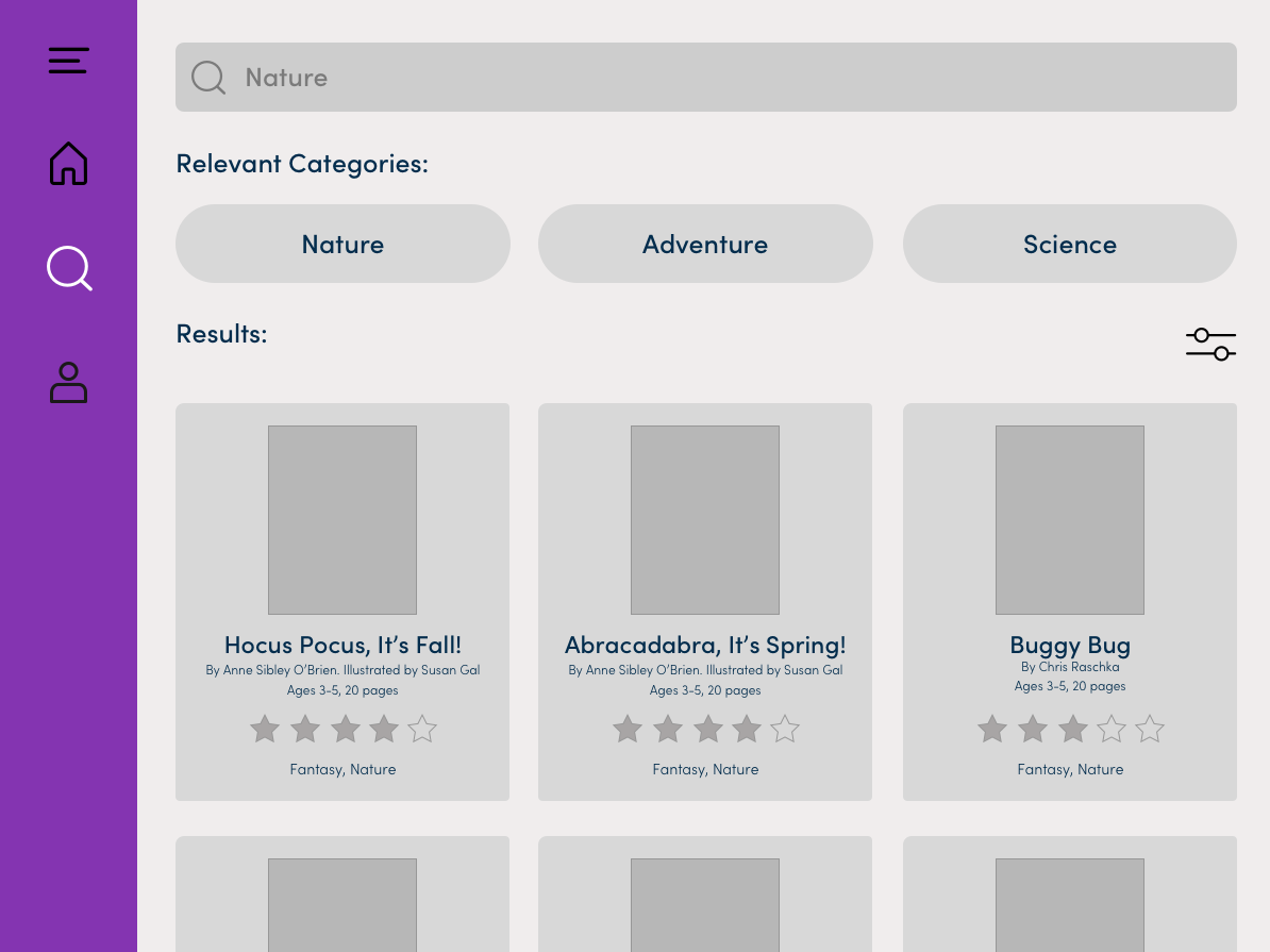
I also added category tags in the search results page, which would lead to that category’s landing page. This solution adds a new level ofn case the user was searching for something more general.
Usability Testing
I was excited to test out the prototype, which was the result of a week of fun but rigorous research, thought and experimentation!
The scope of this prototype was limited, with not a lot of functionality built out. Still I was interested in seeing how users navigated the experience, but was also curious to see if the search path would be preferred over the category path.
3 of the 5 interviewees were parents or grandparents who read books to children - one of these used a similar app to read books to their grandchildren.
After giving each participant a brief background of the project and resulting app, I asked them to find a book about Nature to read to a child.
The first choice everyone made was to click on the ‘Nature’ category button, click on the first book in the landing page carousel, from which everyone immediately knew to click the ‘Read’ CTA.
I was surprised no one thought to use the search bar or search icon. This could possibly be because the interview question was too specific, I would like to try to ask users to ‘find a book about seasons’ for example to see what the results would be.
Generally everyone found the task to be simple to complete and had little to no confusion using the prototype. One of the most interesting suggestions was to add an “estimated read time” on the book detail modal.


Design Sprint Recap
In future design sprints I would want to further hypothesize and test out the other main red routes necessary to create an MVP product for the client. An onboarding flow and many lower-priority but still essential elements of this app could be designed, and a more considered branding approach should be implemented.
For the time being I did another design pass on our low-medium fidelity screens, establishing the bones for a fun, attractive and easy to use solution for parents needing to find a book (or 5) to read to their child.
