Case Study:
Boosting Checkout for a Record Player Store
The Problem:
Sounds of Earth, a medium-sized record player store, uses both desktop and mobile-web experiences to sell online. However, they are struggling to ensure customer conversion. Several key metrics indicate that poor site usability may be preventing the company from achieving its sales goals.
The Solution:
I spearheaded a 2 week mobile-first design effort to bring the web store up to best practice standards, while also introducing several features designed to boost company key performance indicators.
My Role:
- UX Research
- Information Architecture and Wireframing
- Prototyping
- Usability Testing
- Interaction Design
- Branding
- Visual Design
Research
Early on, I had visibility into the site’s main performance issues. The project manager had shared data that shows 50% of users opened on average 7 item pages and then abandoned the site without moving any items into the cart. The project manager’s hypothesis was that users are unable to determine which product is best for them based on relative features.
Additionally, 70% of users who placed an item in the cart did not purchase. Data shows that customers abandon the cart at the registration page, where they had no choice but to create an account to complete checkout.
With these insights in mind, I conducted further research to start ideating possible solutions.
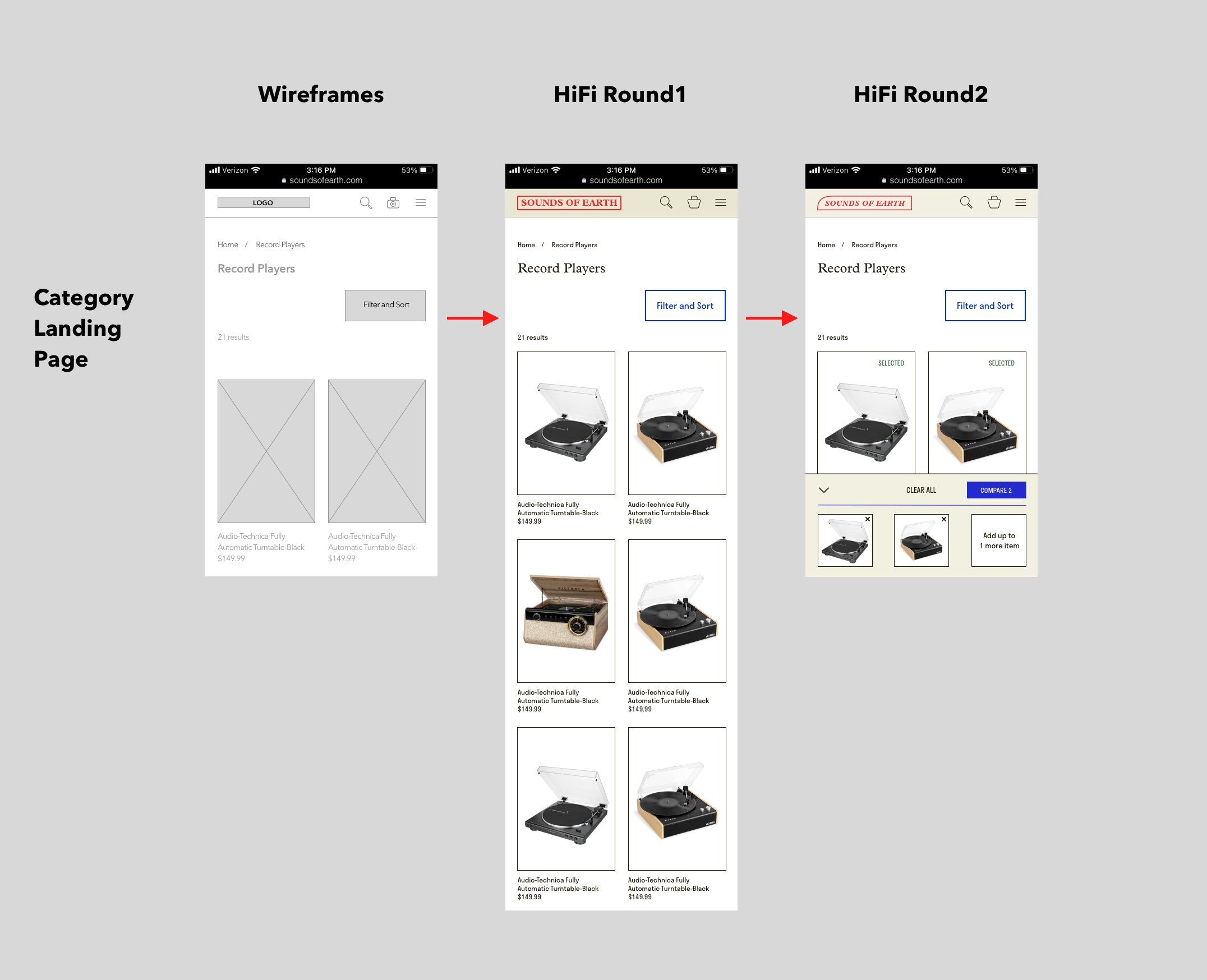
My research surfaced several key elements that could be readily implemented to increase Add-to-Cart, such as cross selling other products on the Product Detail Page, incorporating Reviews and eliminating use of dark patterns which lead to surprise fees (often relating to shipping costs). Minimizing the number of screens a user goes through when adding a product to the cart could make for an easier (and more successful) shopping experience.
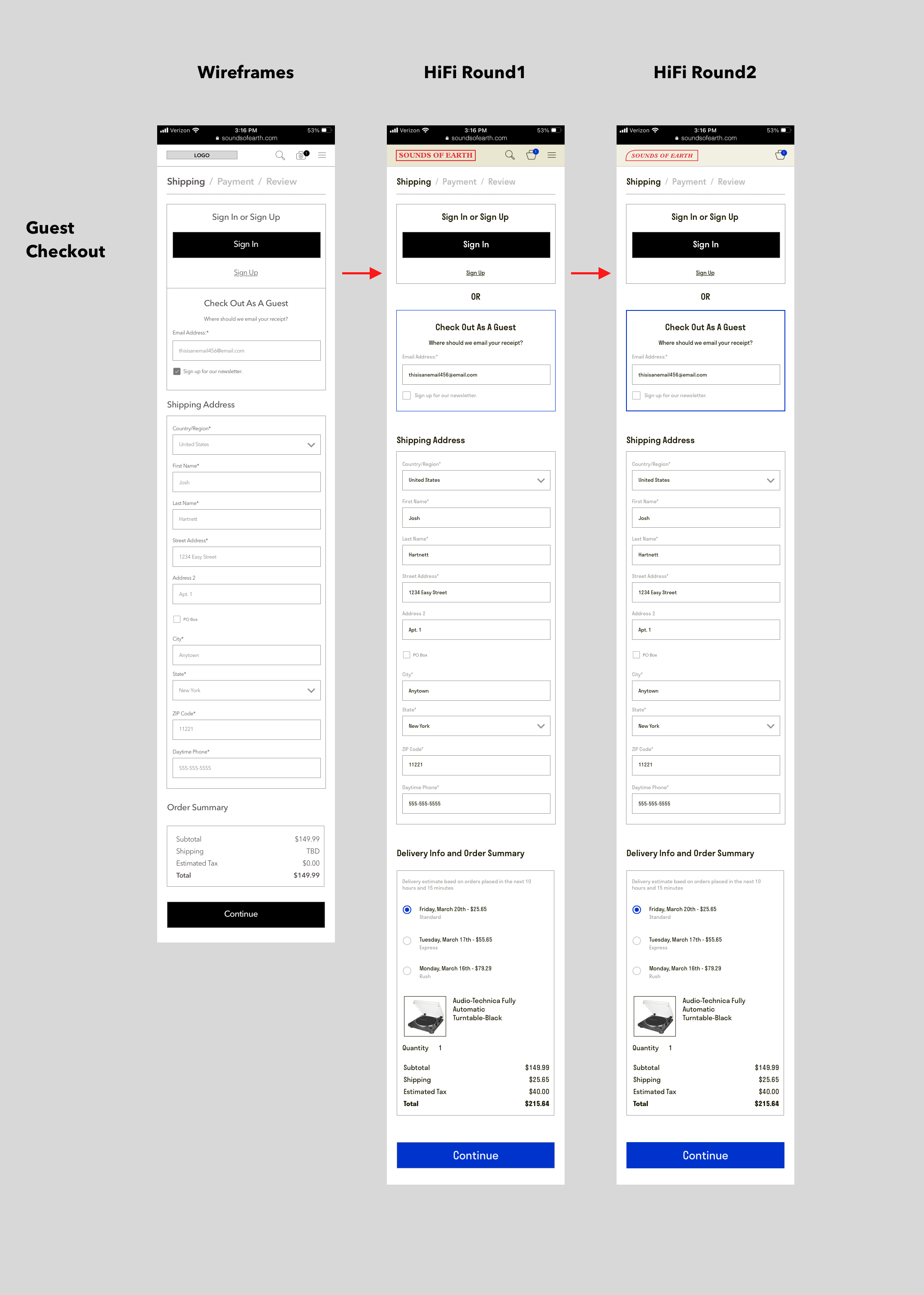
Enabling customers to purchase as a Guest is a common best practice and should be the first step to reduce Cart Abandonment. Increasing the number of pay options to include products like PayPal and Venmo also makes it easier for the customer to convert. Also, adding progress indicators to the checkout experience might help the experience feel easier and quicker.
With these best practice concepts at top of mind, I then analyzed 3 outstanding competitors in the record player ecommerce space. The goal of this research was to ideate ways in which we could deliver an excellent experience for our customers they wouldn’t be able to get anywhere else. I discovered that we needed to maintain a clear and clean aesthetic that reflects the uniqueness of the brand and product, while still orienting the user through a simple Add to Cart and Checkout process. Other companies struggle slightly with consistency and standards, these issues may be resolved more readily with our product, since we are selling a narrower category than these competitors.
To gather direct user feedback I sent out screener surveys asking potential users about their shopping habits and expectations for buying record players online - here are some key takeaways:

- 50% of respondents said they would prefer to check out as a guest when shopping for electronics online, further establishing that this option could be holding users back from completing a checkout.
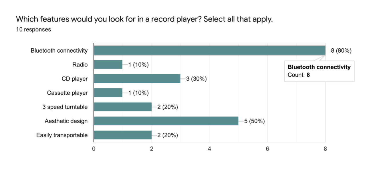
- Bluetooth was a key feature respondents would look for when shopping for a record player - indicating this and other high-ranking features prominently on PDP could boost Add to Cart.
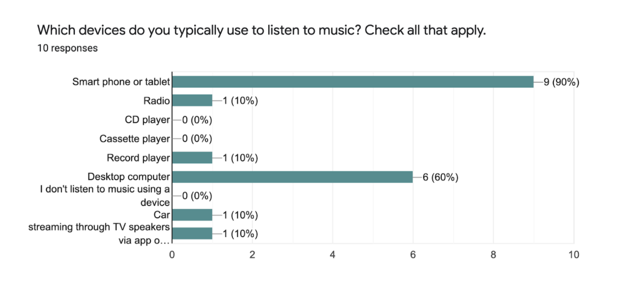
- 90% of respondents use a smartphone or tablet to listen to music, making bluetooth connectivity all the more desirable to customers.
Using insights both provided by the brief and by primary research, I was able to generate our problem statements:
- How might we improve Add-to-cart metrics?
- How might we decrease Cart Abandonment / improve Conversion?
- How might we incorporate a Guest Checkout to reduce Checkout Abandonment?
I could use these main problems to map a journey to a possible solution.
Information Architecture
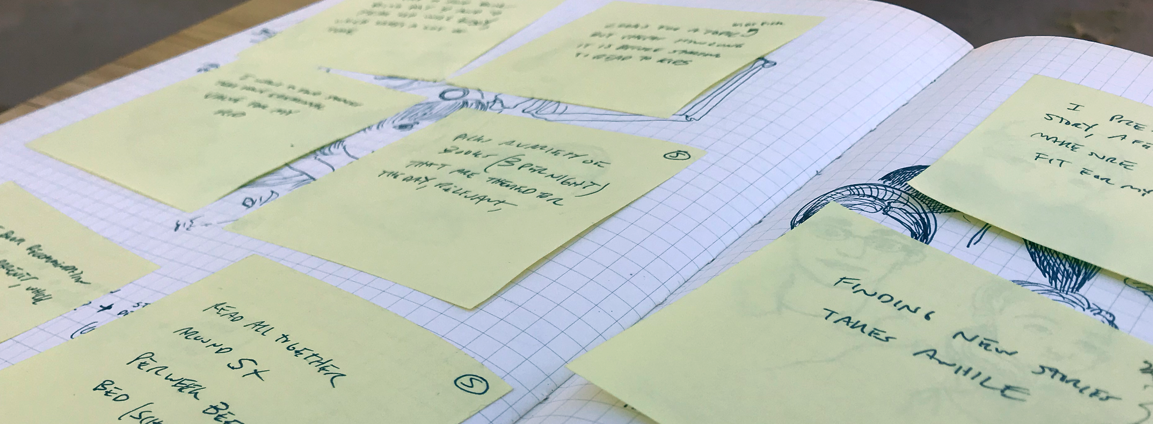
After researching and understanding the problem I began to design an experience that could deliver on the key performance indicators that mattered most to the business. The next step was to design a simple user flow that mapped to those priorities:
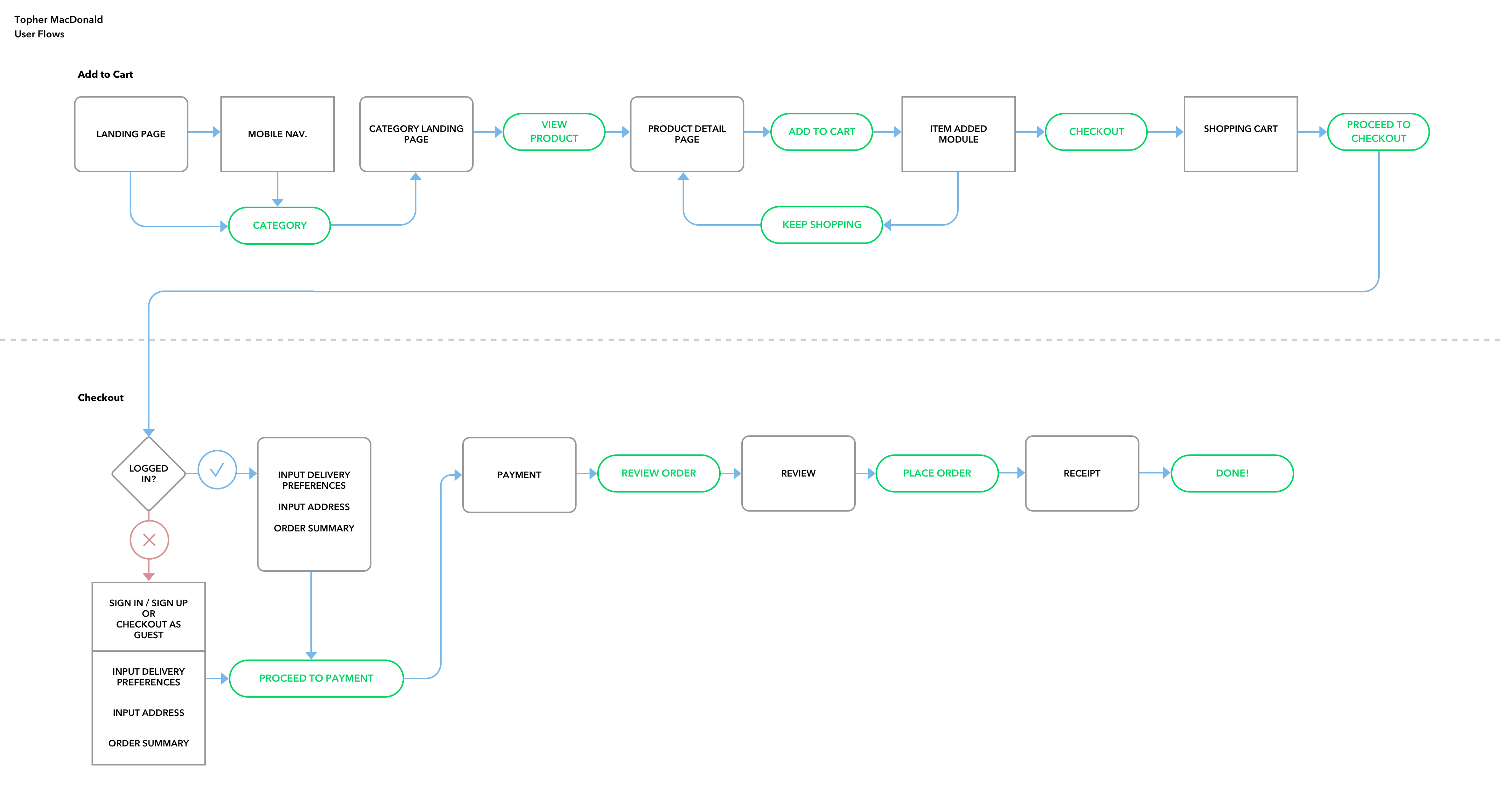
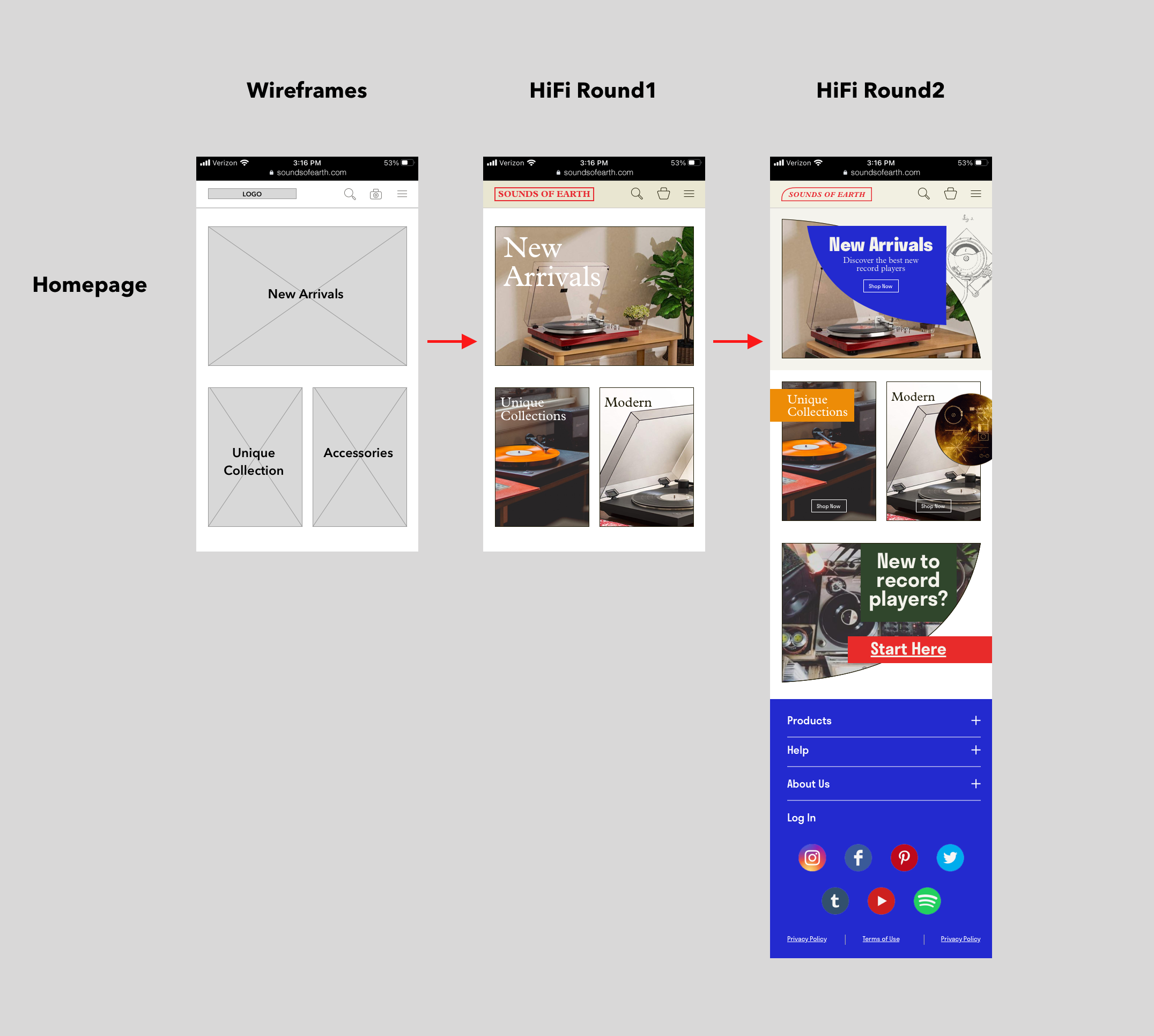
Once this basic flow was established, I created low fidelity wireframes for each of the flow’s screens. The client had provided a few simple wireframes of their desktop experience ideating some possible solutions. However, my research indicated that over 50% of online shopping is now done using a mobile device. With this in mind, I decided it would be efficient to design this flow using a mobile-first approach. If the new experience could be validated on a mobile device, it could readily be scaled to the desktop experience.

My research lead to the addition of several features and updates to these new wireframes:
I was then able to compile these wireframes into an InVision prototype and test my solutions with real people! I conducted 5 remote moderated usability tests using video chat apps like Zoom, Skype and Jitsi with the following goals in mind:
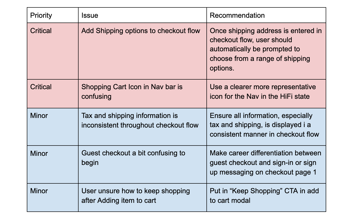
Once the usability tests were completed, I generated a list of the most common problems users identified with the prototype.
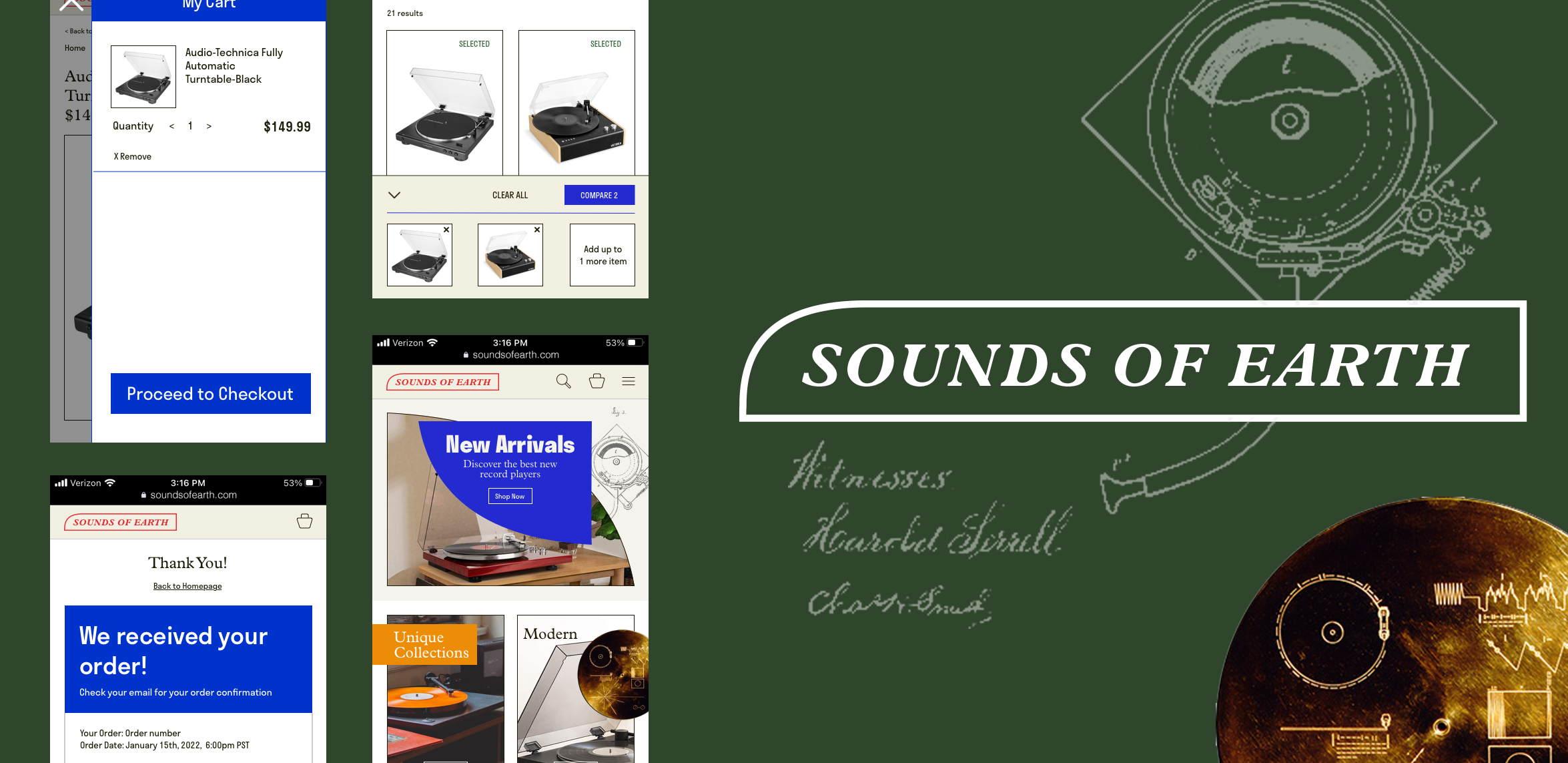
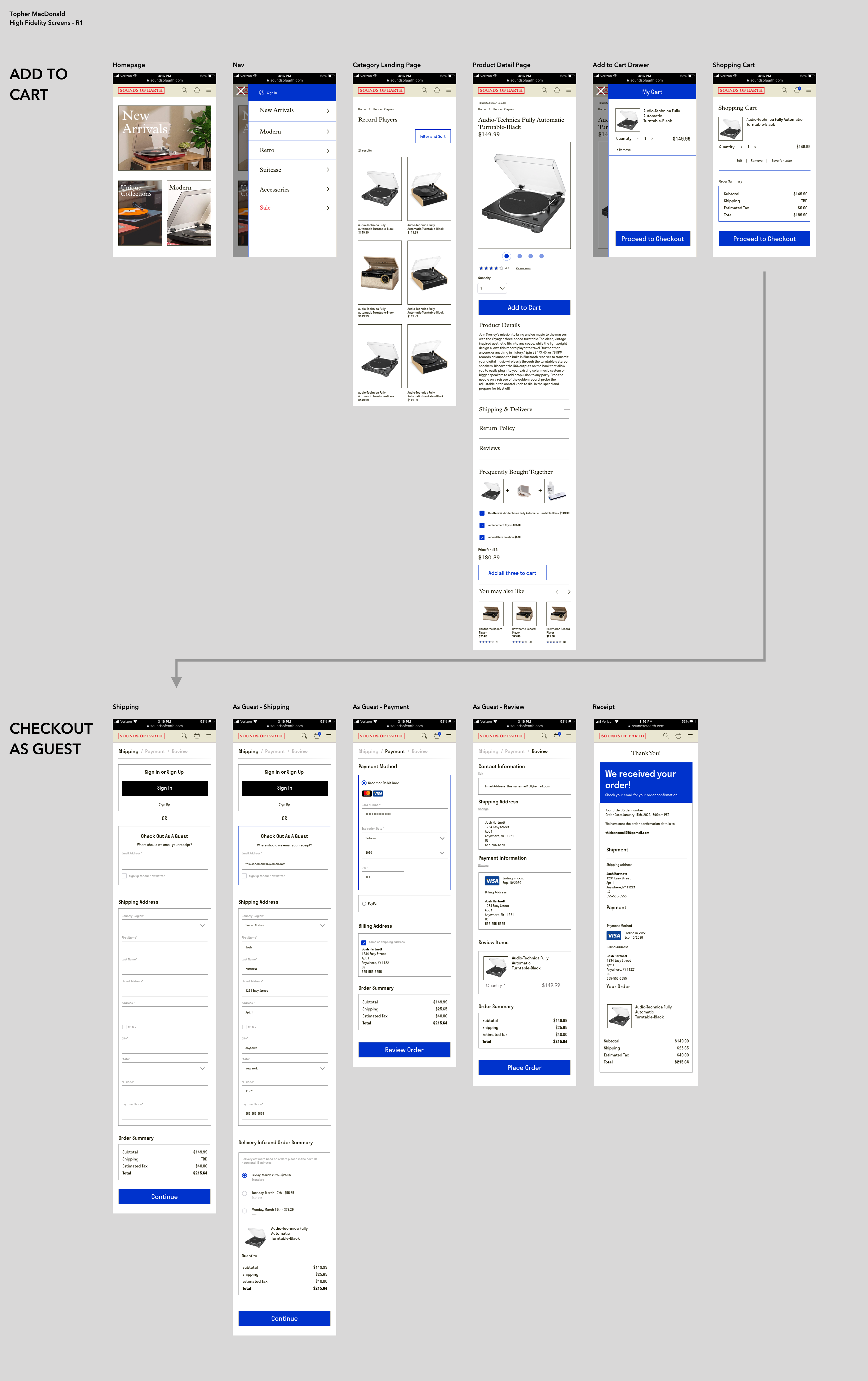
- Added reviews to PDP
- Added carousel showing multiple product photos on same page
- Homepage shows cross sells of product categories above fold
- Added collapsible drawers for Product Specs, Shipping, Return Policy
- User confirms add to cart with dismissable modal that offers quick road to checkout
- Added distinct Guest Checkout option to flow along-side usual ‘Sign-in’ or ‘Sign-up’ options
- Added PayPal as a payment option in checkout
I was then able to compile these wireframes into an InVision prototype and test my solutions with real people! I conducted 5 remote moderated usability tests using video chat apps like Zoom, Skype and Jitsi with the following goals in mind:
- Implement and test ecommerce best practices
- Test ideas for solutions that could improve Add to cart
- Implement and test Guest Checkout flow
Once the usability tests were completed, I generated a list of the most common problems users identified with the prototype.
Visual Design
I attempted to solve the issues revealed in the Wireframe usability tests moving into the High Fidelity prototype.
Once the High Fidelity Prototype was completed, I completed another round of user tests with new subjects. These tests showed the issues raised in the wireframes had been addressed successfully. These tests also built a stronger case for more features that helped users decide between similar-looking products, such as a Compare feature, and led to a rethink of the shopping process.

In addition to adding the Compare feature, I used this opportunity to tighten up the overall experience:
- Implemented a more refined branding and further unified the component library
- In Checkout, I updated the nav to limit icons to just the shopping cart
- Clarified Guest path when selected in Checkout flow
- Added prompts to return to site from Receipt page
- On the Product Description Page, I revealed the Reviews section, made product description a bullet point list
In Review
This project was a great experiment that shows it does not take a long time to understand a business problem, deeply research the industry space, create solid design solutions and validate them through user testing. With an approach like this companies can see a significant increase in key metrics and a substantial ROI.