Case Study:
An App that helps Therapists help
their Clients
The Problem:
The coronavirus pandemic has brought on a mental health crisis which requires new tools and approaches to help both therapists and their clients to succeed.
The Solution:
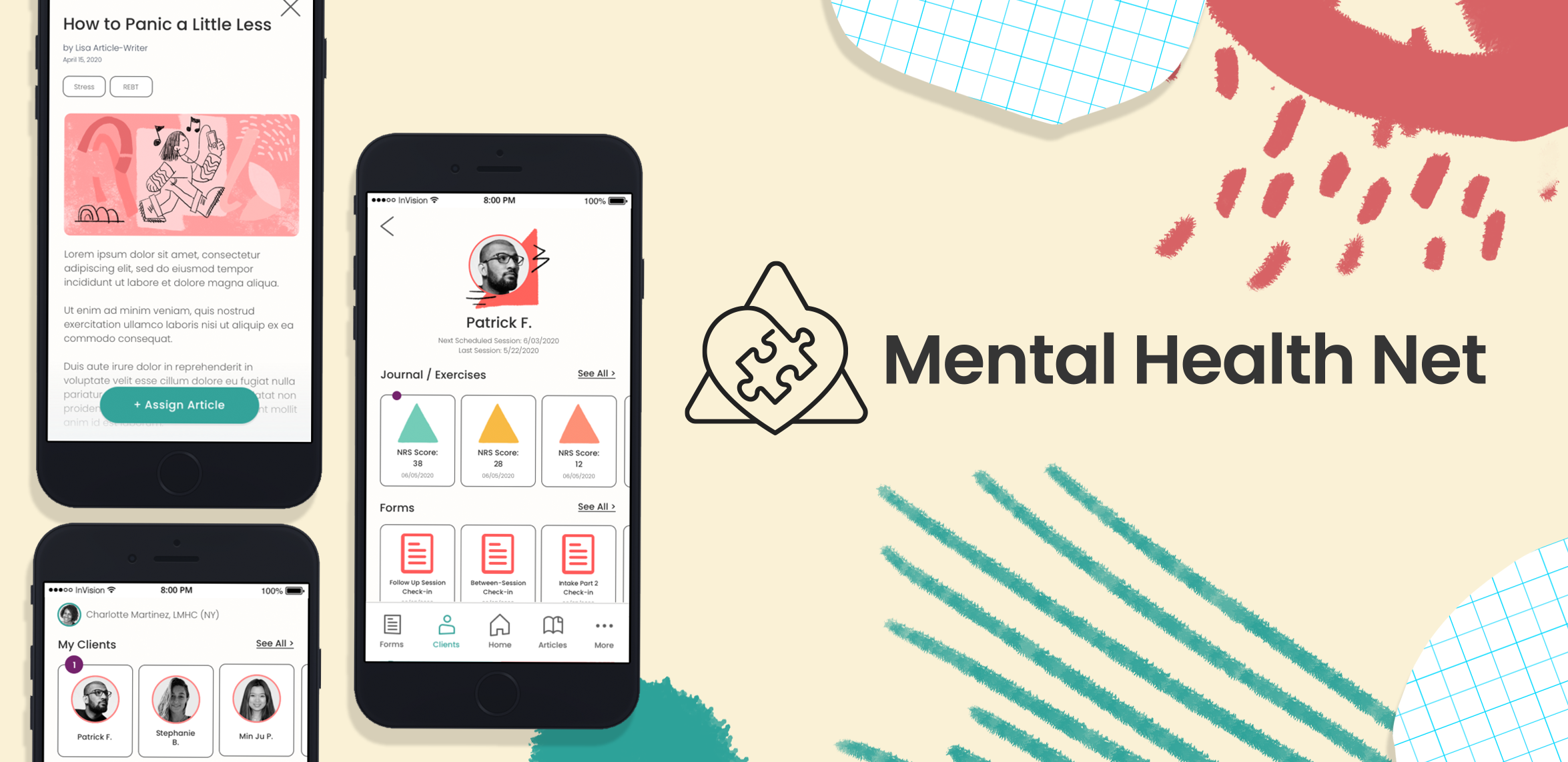
A mobile app that improves communication between patient and client by leveraging therapist-designed exercises and articles to help patients take charge of their own mental health.
My Role:
- UX Research
- User Research & Interviewing - Ideating
- Information Architecture and Wireframing - Brand Guidelines
- Prototyping
- Usability Testing
- Interaction Design
- Visual Design
Research
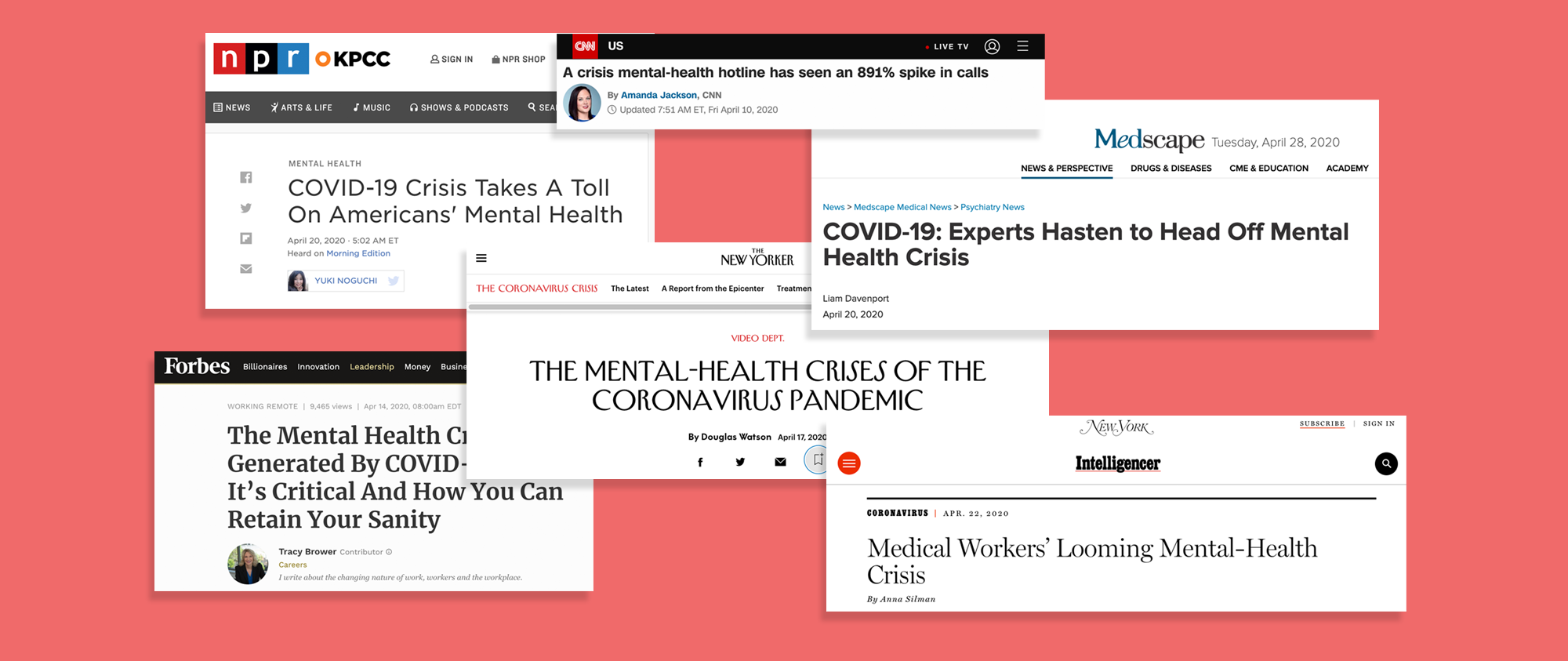
We experienced a mental health crisis in the wake of the coronavirus pandemic. Clients, unable to leave their homes to make their in-person therapy appointments, struggled to access counseling when they needed it the most. At the same time, therapists scrambled to meet the sudden demand for remote counseling. A glance at the headlines suggested the current patient/therapist system was not adequately meeting people’s needs in this new paradigm. We needed to create new tools to meet this challenge to provide mental health care to as many people as possible, as quickly as possible.
Of the range of therapy styles in practice, there is a framework that may help to provide solutions.
Rational Emotive Behavioral Therapy (REBT)
This method of psychotherapy developed by Dr. Robert Ellis, teaches an efficient process which patients can use to diagram their own negative feelings with the help of a licenced practitioner. REBT is the original form of Cognitive Behavioral Therapy (CBT), which has been shown to improve outcomes in clients suffering from PTSD, anxiety disorders, somatoform disorders, bulimia and anger control problems, to name a few.
Maslow’s Hierarchy of Needs
We can also refer to an up-to-date model of this motivational theory, represented visually as a pyramid, to provide additional help to clients assess where their needs are not being met.

We can leverage these methods to create an exercise that actively teaches clients how to identify their reactions to events (negative or positive), how to assess if they are an accurate depiction of reality and, if they are not accurate, how to overcome them.
Primary Research
Once our secondary research shed light on a viable therapy framework for our product, we began to collect primary data to help guide our design process. We surveyed and interviewed potential users to understand the pain points of their therapy experiences.
User Interviews
A product that connects therapists to their clients has two distinct set of stakeholders, and, therefore, needs two distinct user experiences. We sent out screener surveys to fill two pools of user types based on this criteria:
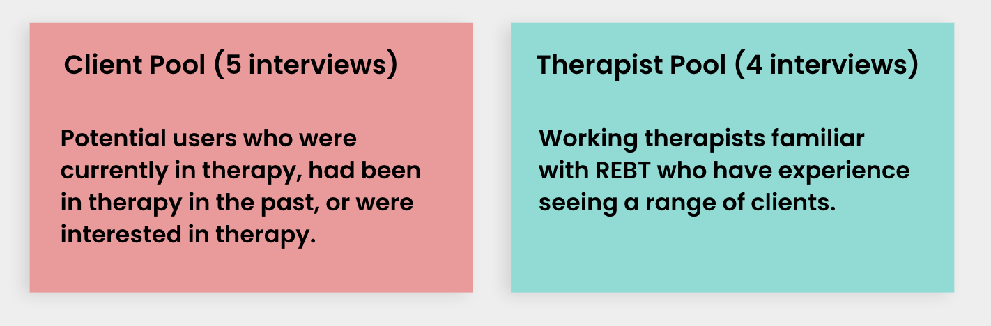
Each interview was conducted remotely using Zoom, Skype or Jitsi and lasted around 30 minutes each, though a few spread to over an hour - everyone has a lot to say about therapy, which is very exciting!
Synthesizing the Data
After the interviews were completed, we created an affinity map to begin processing all that we had learned about our users. At this stage we began to discover patterns, common connections, and misconceptions about therapy.
Synthesizing the Data
After the interviews were completed, we created an affinity map to begin processing all that we had learned about our users. At this stage we began to discover patterns, common connections, and misconceptions about therapy.

We were then able to create empathy maps for our potential users, further defining the thoughts, feelings and actions of both sets of stakeholders.
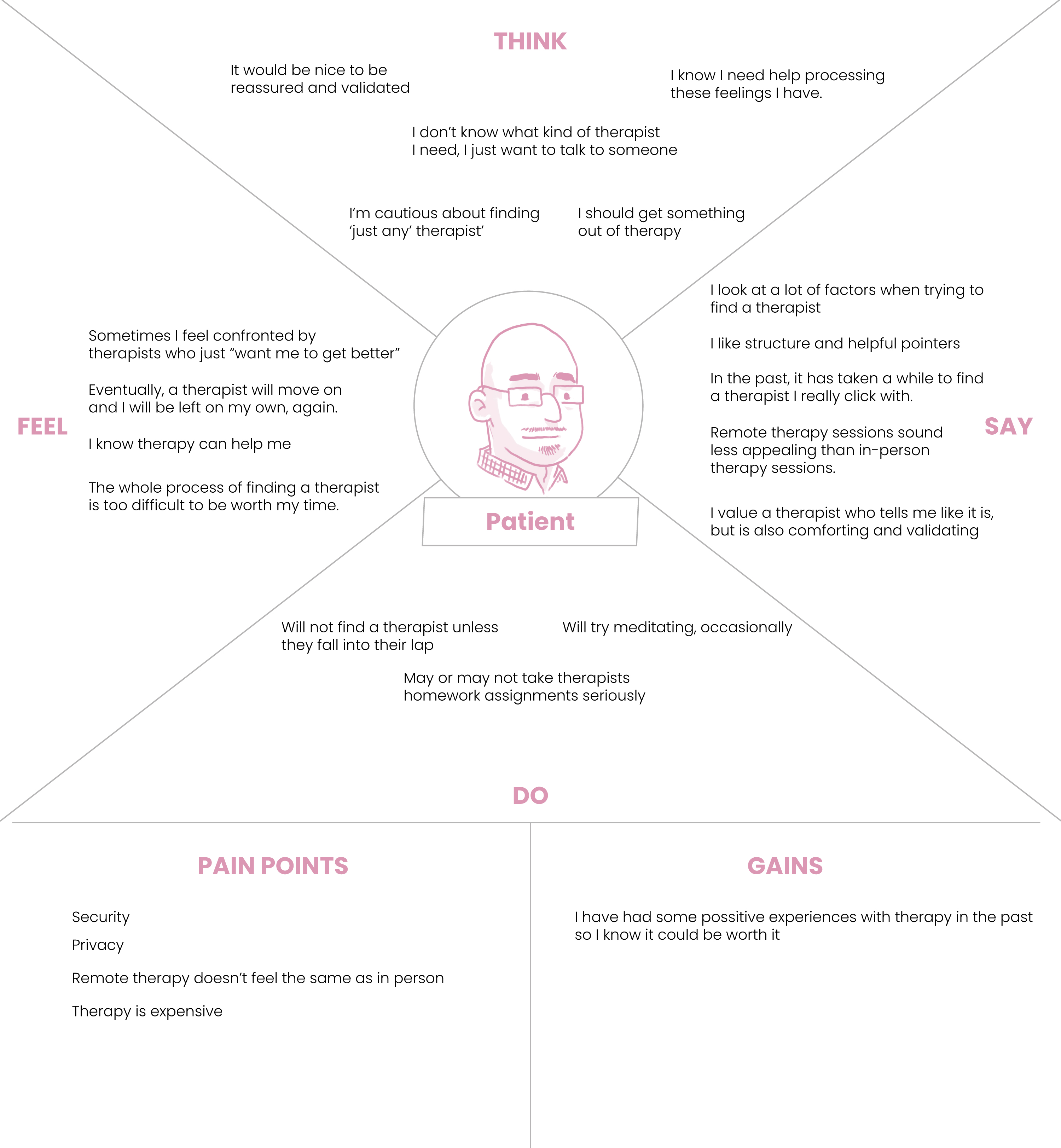 Empathy Map: Client
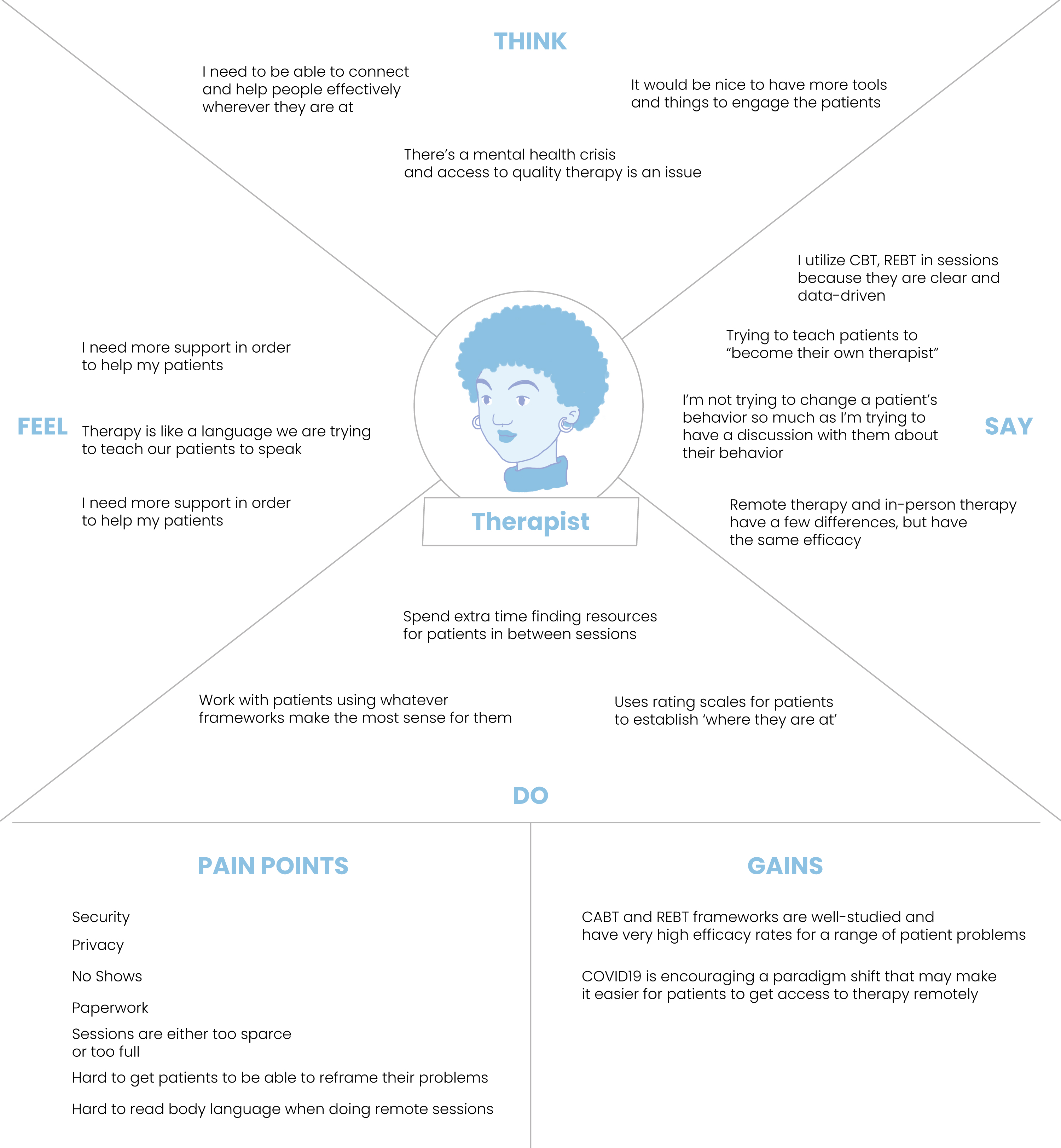 Empathy Map: Therapist
User Personas
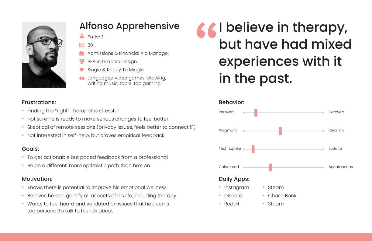
The empathy maps eventually boiled down to two user personas. The first of which is the Client persona.
This is a user who is not currently in therapy, but has been in the past. They are interested in starting therapy again, but have developed a laundry list of pain points from their experiences. They think the process of finding a therapist is always stressful because they feel they have to find the ‘right’ one, or else it’s a waste of time.
In past therapy experiences, they have received feedback, but were unable to implement it successfully. They value empirical feedback and believe therapy could help them get on a more positive path, but they just haven’t found the ‘magic moment’ in therapy that they’re looking for.
We also have the Therapist user persona. They have a range of therapy styles at their disposal, though they primarily using Cognitive Behavioral Therapy (CBT) & REBT in sessions.
They have some pain points regarding the behind the scenes aspects of therapy (such as paperwork and dealing with no-shows), but their primary concern is with doing what is best for the client. They want the patient to feel as if they are on the same team as the therapist. They want the client to learn how to self-regulate their emotions, and to take part in their own success.
They have some pain points regarding the behind the scenes aspects of therapy (such as paperwork and dealing with no-shows), but their primary concern is with doing what is best for the client. They want the patient to feel as if they are on the same team as the therapist. They want the client to learn how to self-regulate their emotions, and to take part in their own success.

Restating the Problem
After synthesizing our research we are able to reframe and restate the problem our product should solve in the form of a ‘how might we’ statement. We went through a few iterations:
After synthesizing our research we are able to reframe and restate the problem our product should solve in the form of a ‘how might we’ statement. We went through a few iterations:
- How might we facilitate the exchange of feedback between patient and therapist?
-
How might we streamline the therapist’s time gathering materials for their patients?
-
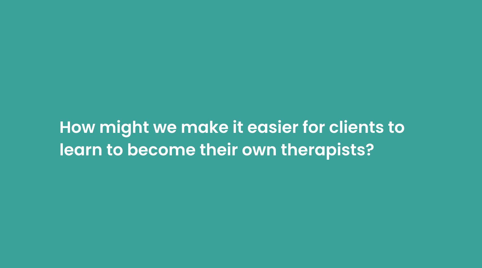
How might we make remote therapy sessions more personal and supportive for patients?
A common assumption we saw in our research is that those seeking therapy are overly-focused on the therapist being the “right” therapist, or that therapy is easier in person, and that therapy is for LIFE. But what if you don’t have access to therapy? What if another pandemic hits and we go back into quarantine? What if we never find the “right therapist” in person, remotely or otherwise? Is there a way to teach people to process their own negative feelings and engineer their own, more positive outcomes, in the midst of ANY situation they face?
To be clear, we are not advocating that anyone and everyone can or should become a licenced therapist! However, if a framework exists to help people address their own distortions, and this framework can be taught, the priority is to give this framework to whomever needs it.
Restating the Solution
We focused on creating a mobile app that better facilitates interactions between therapists and their clients while helping clients learn the REBT framework to buttress their own mental health efforts.
In our research, we also discovered the therapy app space is a crowded one - a quick search on your app store of choice could yield 30 or more products. To further understand how our app might stand out from the rest, we conducted a heuristic analysis of our competitors.
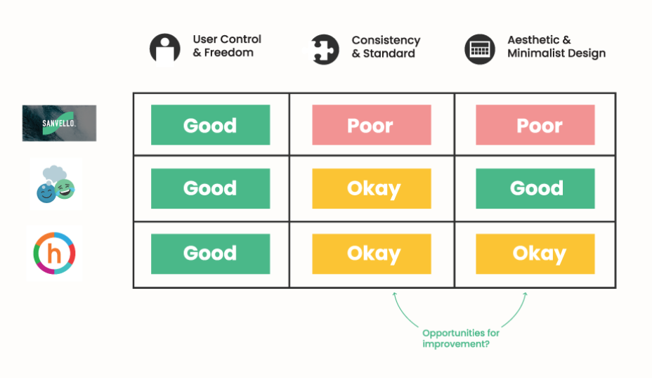
Seeing other apps struggle in the areas of consistency and aesthetic design, we were encouraged to focus on these areas as we designed our product.
Information Architecture
With research to support our approach and a long list of pain points to address, we set out to define exactly how a useful app should function as a solution. We created a series of user stories, a list of features that our app should include in order to foster desired outcomes for our users.
We narrowed that list down to the features that would make up our MVP, or Minimum Viable Product. Knowing these necessary features allowed us to create a Sitemap to establish the geography of our product, and helped us establish our Red Route user flows for both Client and Therapist experiences- the routes of critical tasks in an app that deliver the most value.
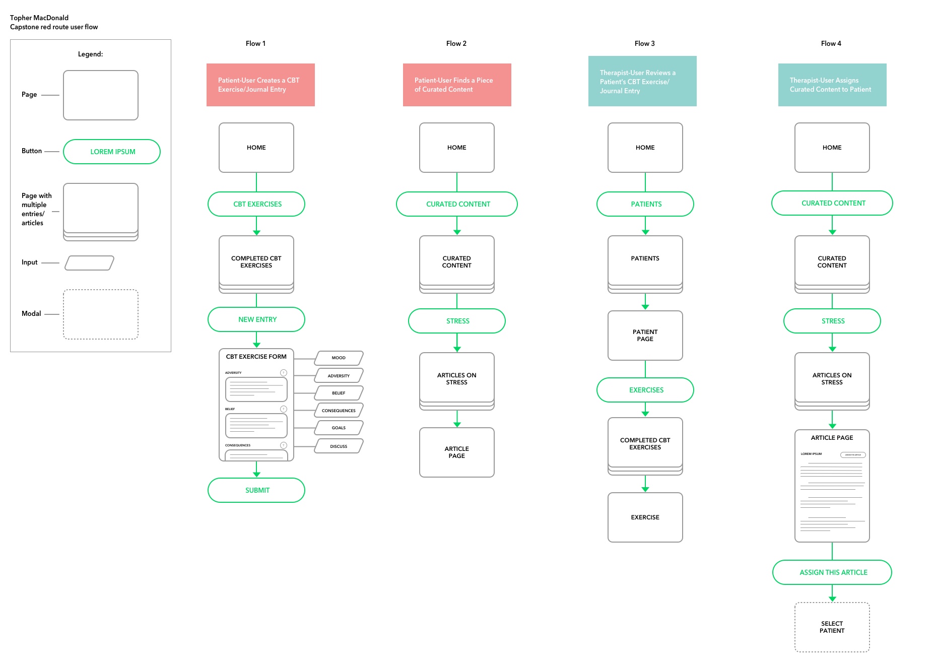 Red Route User Flows
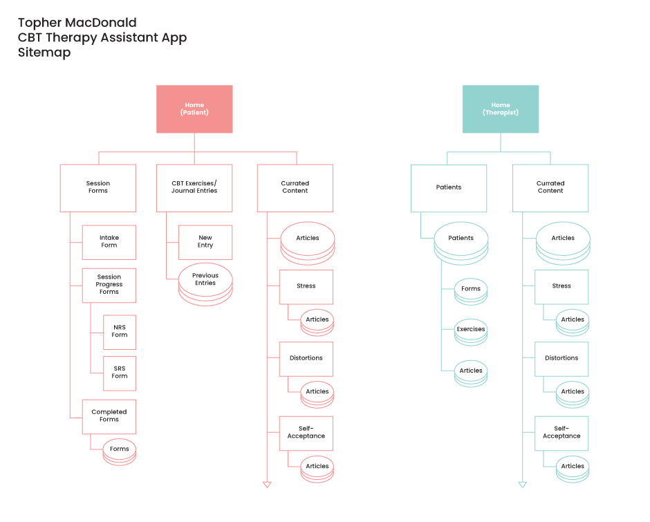
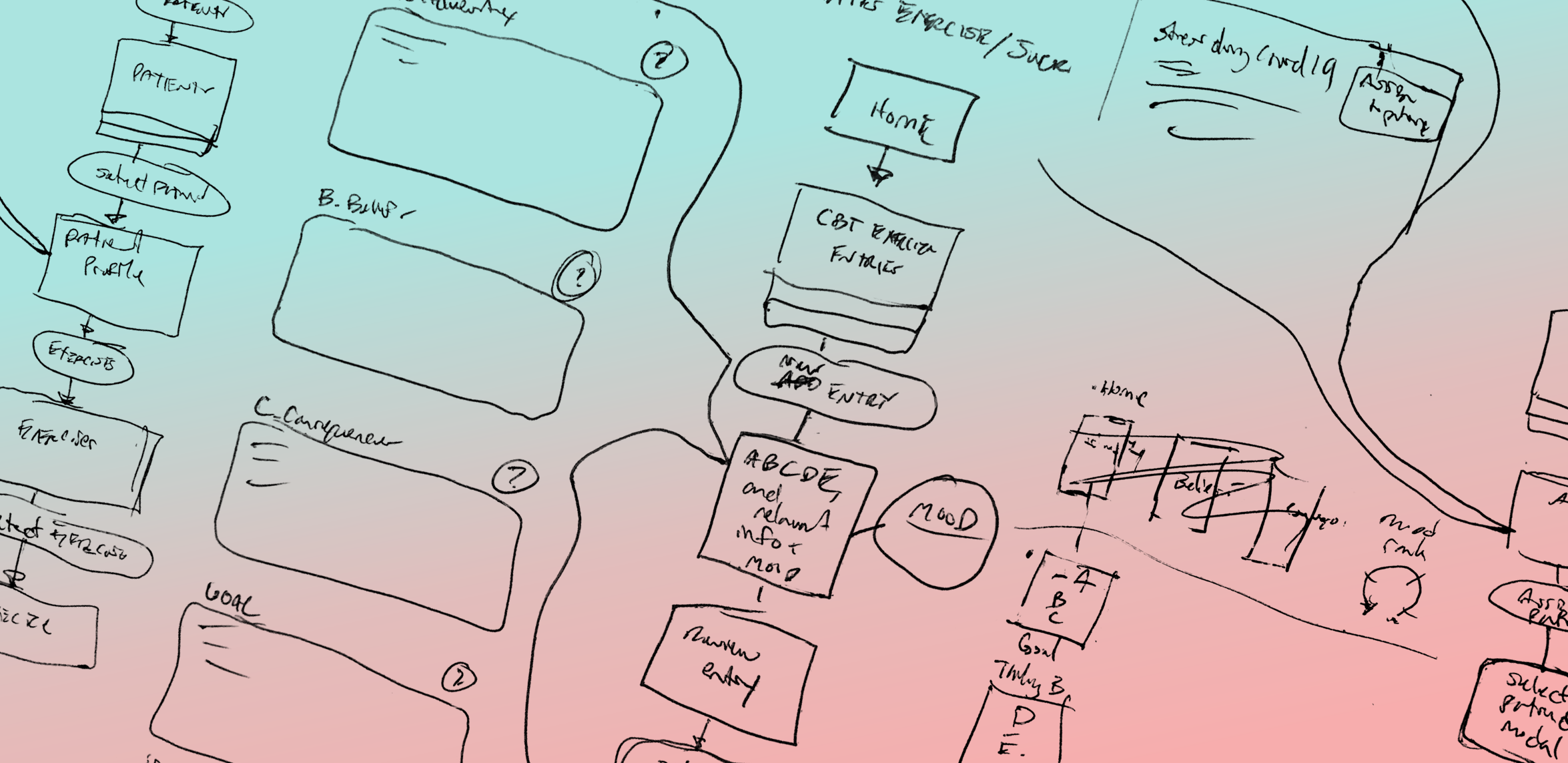
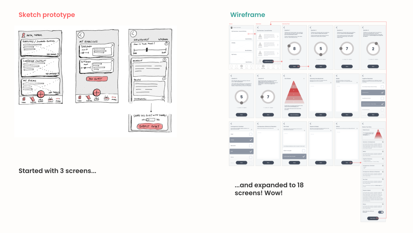
Sketching
With our red routes established we began to sketch out our ideas for how each step in the flow could work for the user.
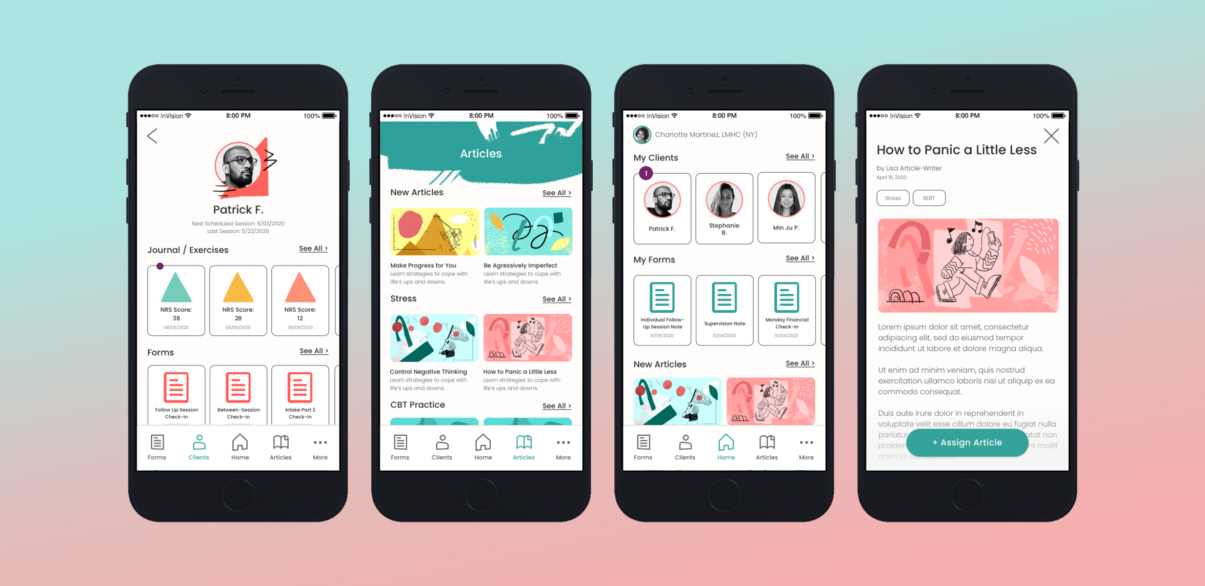
The most important feature for both user experiences would be the Exercise Entry that a client could complete in the app, share with their therapist, who can then review it on their end. For the client, this exercise is designed to reinforce what the therapist practices with their clients in session, and is the cornerstone of the product.

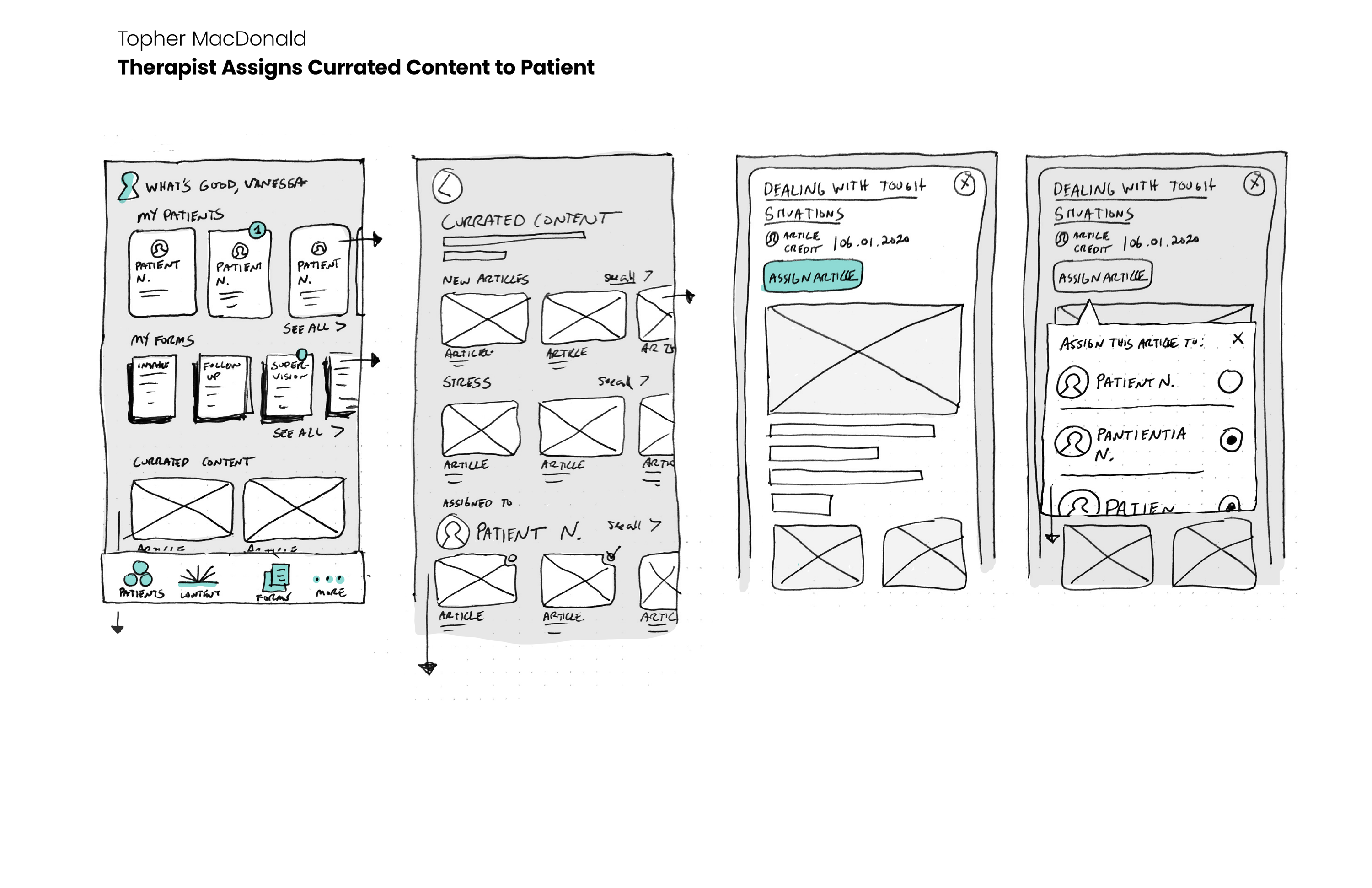
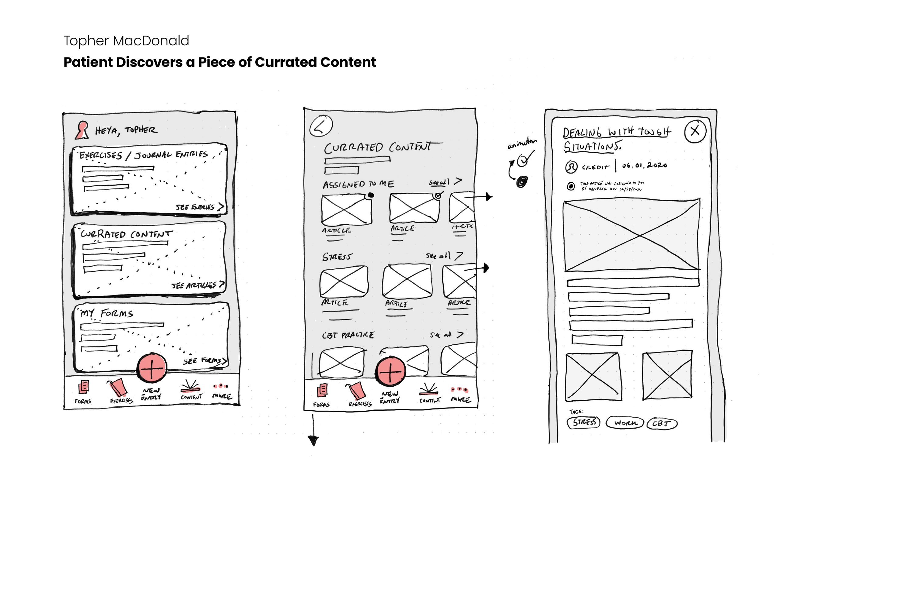
In addition to enabling the therapist to easily review their client’s exercises, we wanted to make sure their interface was clear and uncluttered and serviced the day-to-day practice of seeing and advising clients.
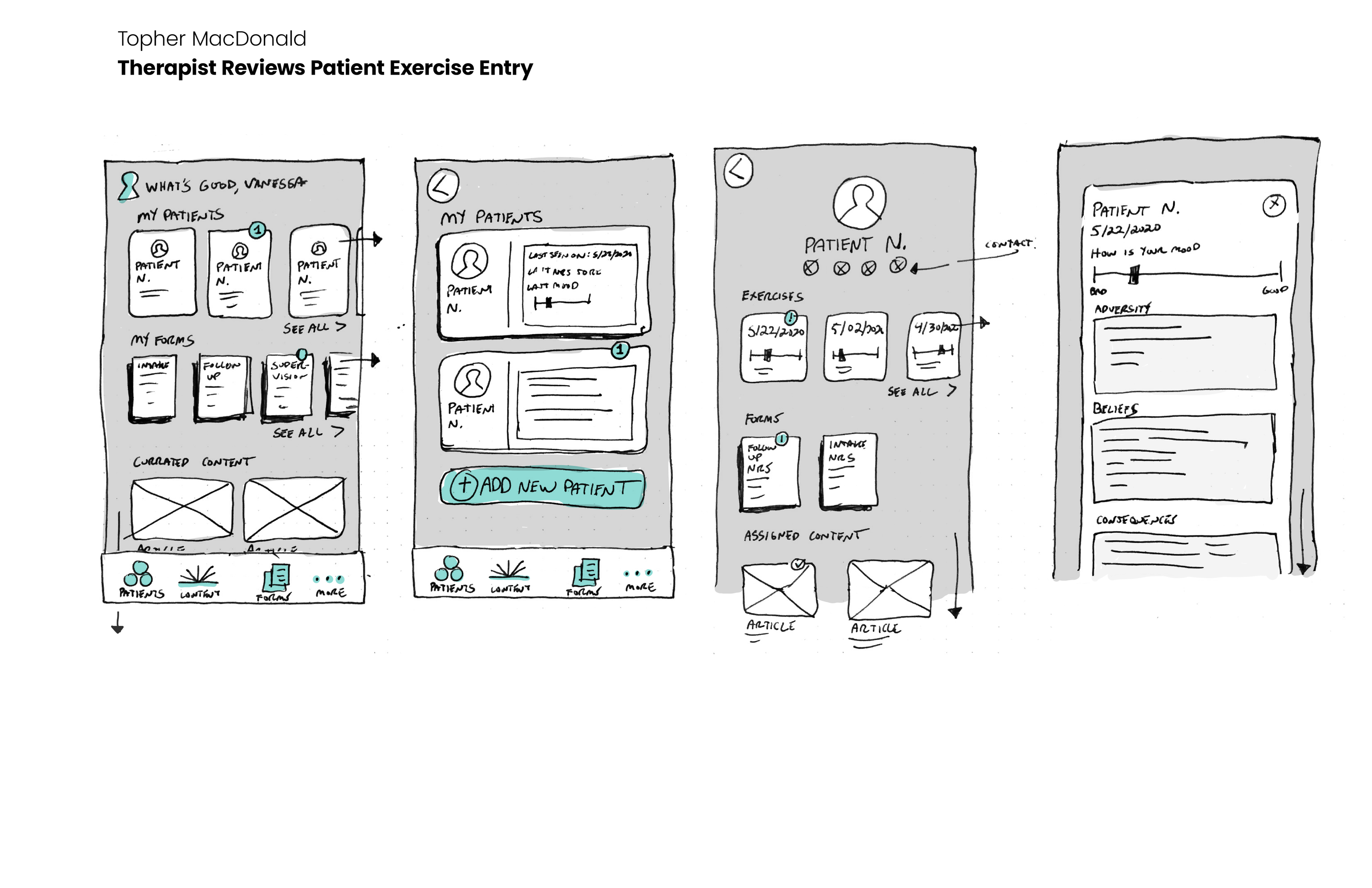
Guerilla Usability Testing
We created a simple interactive prototype using our red route sketches which we used to conduct remote usability tests to see where functionality improvements could be made. We asked users in both pools to complete our most critical tasks using the prototype as if it were an actual product.
Users generally found the prototype to be appealing in its function and easy to understand. All users were able to recognize navigation patterns (back buttons, x buttons to close out) and could move throughout the app easily.

However, these tests revealed some critical issues with our prototype. A key example being with the Therapist red route - “assign a client a piece of content to read”. Initially, every user was confused by how to complete this task, not knowing where to go or what to do when they got there.
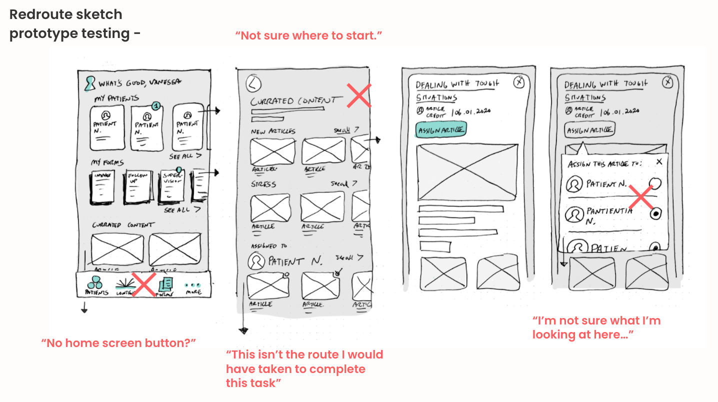
Fortunately, this is what prototype testing is for! We were delighted to discover this issue (along with many others) that would be addressed during the next design phase.
Wireframing & Wireflows
Taking what we learned in our guerilla usability tests of our sketch prototype, we set to work on our wireframes, which gave us an opportunity to restructure some key experiences in our product while laying a stronger framework for our visual design.
We reimagined what our most problematic red route could look like, adding in clearer prompts and a simpler interface to complete the task.
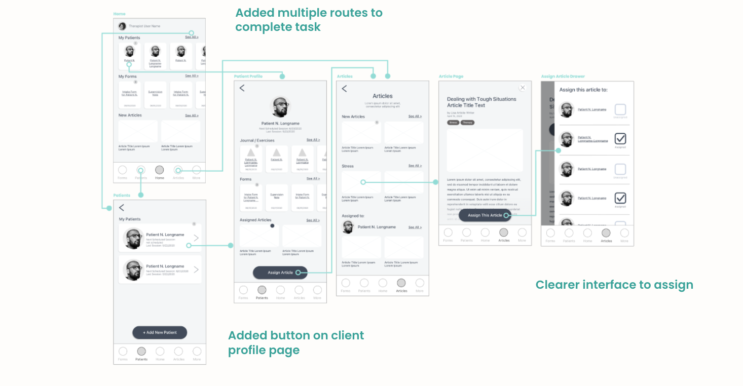
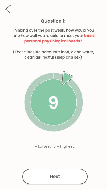
In another instance, we decided that the experience needed to be much more fleshed out for the user. For the client exercise, our sketch showed the entire process on the same screen. For the wireframe phase, we split the exercise up into sections, added screens, and included additional functions to add delight to the experience.
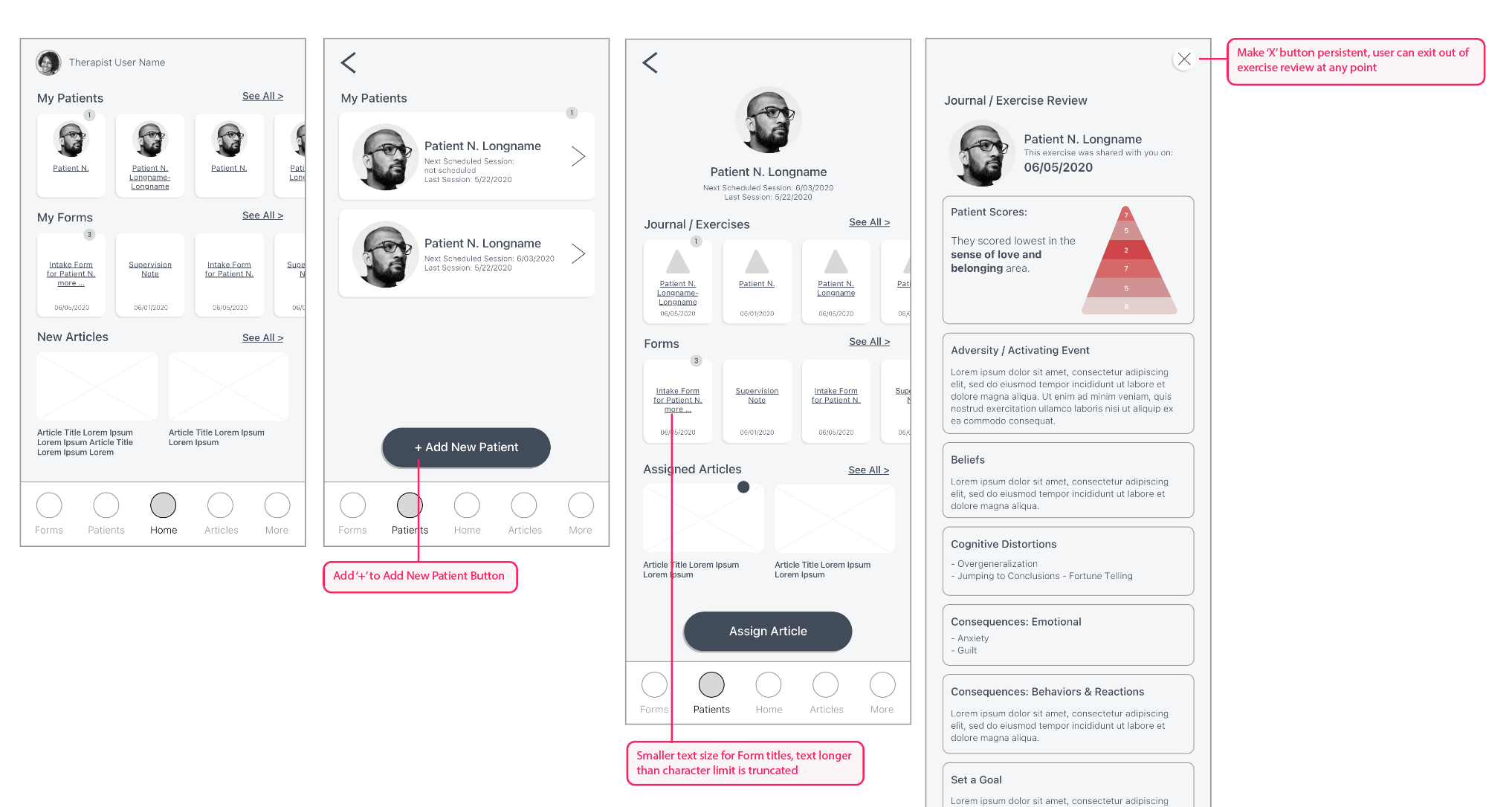
Edge Cases
It was important for us to anticipate every snag a user could possibly encounter when completing a task in our product. For example, what if a user’s name took up more than 2 lines? Or what if the user scrolls past a key button without acting? We did an edge case review and subsequent iteration of our wireframes to ensure our user experience could hold up in an unusual scenario.
It was important for us to anticipate every snag a user could possibly encounter when completing a task in our product. For example, what if a user’s name took up more than 2 lines? Or what if the user scrolls past a key button without acting? We did an edge case review and subsequent iteration of our wireframes to ensure our user experience could hold up in an unusual scenario.
By this point in the design process we were feeling confident we had the bones of a product that could effectively help people during a mental health crisis. Next, we set our sights on creating a compelling brand that would shepherd our users through the therapy process.
Brand & Style Guide
As we moved closer towards working on the high-fidelity design of our product, we knew we needed to create a strong visual brand experience that felt tactile, vibrant, courageous, fun and loose - something that mirrored a bit of what we’d like to think the experience of therapy can be like.
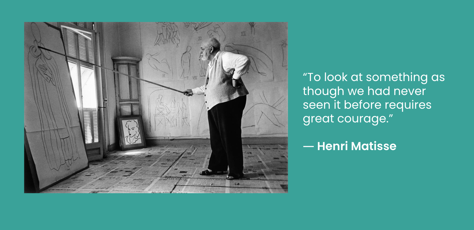
At top of mind was this quote by the french expressionist artist Henri Matisse, whose work and philosophy were of great inspiration at this stage.
We wanted our branding and visual design to reflect the excitement and optimism that comes from complete self-acceptance. The therapy process can feel challenging and maybe even a bit messy - and that’s ok!
We found it helpful to further define the most important parts of what we wanted to accomplish using our Brand Platform.
Our Mission
Teach clients to be active in their own mental health, learning to become their own therapists.
Teach clients to be active in their own mental health, learning to become their own therapists.
Our Personality
Therapy can be uncomfortable and enlightening, difficult and rewarding, direct and kind, full of ups and downs, but the process should always be hopeful and validating and lead to self-acceptance.
Therapy can be uncomfortable and enlightening, difficult and rewarding, direct and kind, full of ups and downs, but the process should always be hopeful and validating and lead to self-acceptance.
Our Attributes
Trustworthy, friendly, hopeful, honest, engaging, thoughtful
Trustworthy, friendly, hopeful, honest, engaging, thoughtful
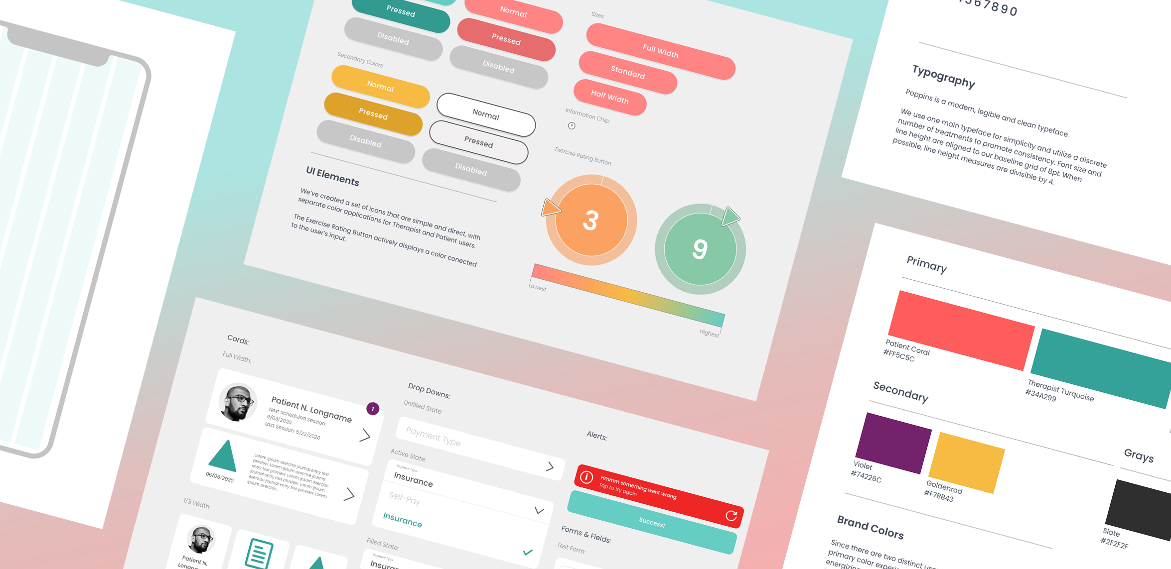
Style Guide
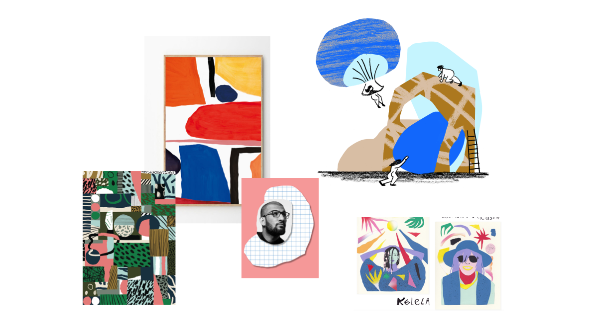
We created several moodboards using work our studio had produced alongside other images we were inspired by. Eventually, we settled on a collage-influenced, hand-made style, and minimizing use of photography, visually showing that the therapy process can be messy and beautiful and rewarding all at the same time.
Logo
We chose to incorporate a few key images from our therapy practice into a one-lined, simple logotype.
We chose to incorporate a few key images from our therapy practice into a one-lined, simple logotype.
-
The Triangle - symbolizing Mazlow’s Hierarchy of Needs
-
The Puzzle Piece - to speak to (and gamify) the goal of solving the problem of your own distortions
- The Heart - because duh!
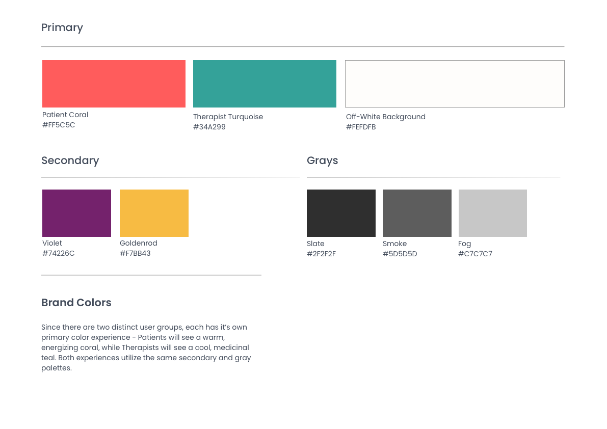
Brand Colors
Since there are two distinct user groups, each has its own primary color experience - clients see a warm, energizing coral, while Therapists see a cool, medicinal teal. Both experiences utilize the same secondary and gray palettes.
Since there are two distinct user groups, each has its own primary color experience - clients see a warm, energizing coral, while Therapists see a cool, medicinal teal. Both experiences utilize the same secondary and gray palettes.
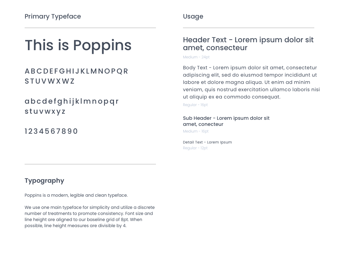
Typeface
We chose Poppins to be our primary typeface across product and branding because it lent a distinctly clean and modern anchor to our otherwise textured and painterly branding.
We chose Poppins to be our primary typeface across product and branding because it lent a distinctly clean and modern anchor to our otherwise textured and painterly branding.


Illustration
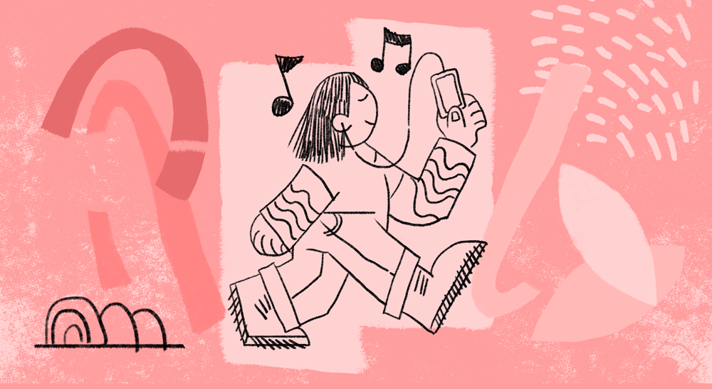
Using a textured and rough approach to our imagery contributed to our user’s sense of adventure, accomplishment and support while using the product. We focused on developing a small library of textured shapes that could be collaged together with loosely drawn characters to create landscapes and narratives in support of our article content and UI.
Using a textured and rough approach to our imagery contributed to our user’s sense of adventure, accomplishment and support while using the product. We focused on developing a small library of textured shapes that could be collaged together with loosely drawn characters to create landscapes and narratives in support of our article content and UI.
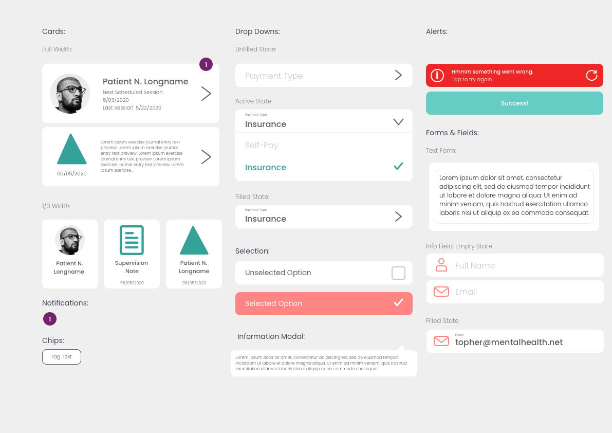

UI Elements
Our UI elements needed to be a mid-point between the rational typeface and our off-the-wall illustration. The shapes are recognizable and functional while remaining bright and fun to interact with.
Our UI elements needed to be a mid-point between the rational typeface and our off-the-wall illustration. The shapes are recognizable and functional while remaining bright and fun to interact with.
Visual Design
Putting together the final screens felt a bit like a victory lap; our research solidly defined our problem and our approach to a solution, we put a lot of thought and time into crafting our information architecture to best solve our problem, we felt confident about our branding approach, and now we got to put all the pieces together and test.
High-Fidelity Prototype
We took great care implementing our branding into a first pass of high-fidelity designs and were perhaps overly cautious at first, ensuring the content and architecture were legible and clean.


As we went through the design process we took note of little opportunities to add delight to the experience. Certain UI elements we thought could benefit from a little bit more of that fun illustration style. Our icons felt a bit too serious. Some of the color choices were counter intuitive to their use-case.
In other instances we found that our style guide needed to be adjusted to ensure our product was as easy to use as possible. For example, when we conducted an accessibility audit of our designs, we found our primary coral and turquoise colors were too light to read white text on top of, and did not meet the standards as defined by WCAG (Web Content Accessibility Guidelines). This was a small but critical fix that would scale the entirety of our product. In the future we will consider these accessibility guidelines earlier in the design process.
Fortunately we had built in time to complete several iterations of our design, and we were able to quickly address these issues!
Usabilty Testing
In order to ensure we were still on the right track with the updates we made to our information architecture, we conducted 2 rounds of 5 remote moderated usability tests using video chat apps like Zoom, Skype and Jitsi. Participants in this study had prior knowledge of this project, and either had some experience as a client receiving therapy OR have some experience as a practicing therapist seeing clients. Each session was approximately 20-30 minutes long. We asked participants to complete tasks as if they were a “Therapist” user and a “Client” user, indicating which experience or “mode” they were in before detailing the tasks to them.
In between these two rounds, we did one design iteration using the feedback from the first round.
The objectives of these tests were to:
- Gather impressions of general branding related to project mission
- Uncover usability issues in red routes
- Compare and contrast behaviors of Client users to Therapist users
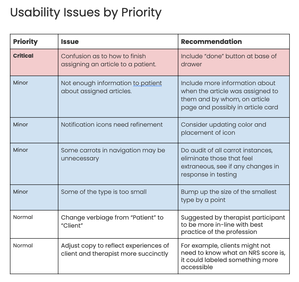
We compiled a list of all notable issues to solve and ordered them by priority, ensuring that our final round of design iteration would be impactful to the product.
Final Iteration
As we got closer to the final designs of our product, we were able to refine the experiences and be a bit bolder with our imagery. We addressed the list of improvements we made from the first interaction, along with the pain points from our rounds of usability testing. These included type size, adjusting our treatment of notifications, adding in clearer prompts to complete tasks, and unclear nomenclature using extensive insight from practicing therapists.
We are really excited about the result!


Reflection &
Next Steps
We are excited to take next steps in developing this app to be used in conjunction with our therapy clinic, and have high hopes it will help clients and therapists do the work that is so crucial for us to be doing amidst a mental health crisis.